Dishoom: A journey back to Old Bombay
Popular restaurant brand Dishoom pays homage to the old Irani cafes of Bombay, and brings the charm and nostalgia associated with them to the heart of the UK

Founded in 2010 by cousins Shamil Thakrar and Kavi Thakrar, Dishoom is today a popular restaurant group in the UK with nine restaurants and 1,700 employees.
During the pandemic, Dishoom started offering at-home meal kits as a part of its delivery service. The meal kits have become so popular that the brand launched a range of products for customers to purchase through its restaurants and eCommerce platform. Its product range includes
chutneys, spreads, cocktails, spice kits and chai curated by Dishoom chefs and its bar team. Now Dishoom customers and fans have a way to take some of the brand’s romance home.
Authenticity is important to the cousins and is reflected in its packaging and label designs.
The Dishoom design team takes great care in researching everything from fonts to colors and imagery to accurately represent Indian culture. History is also a big part of what the design team does, and their love of historical places across Bombay has influenced their label designs. The Art Deco heritage in Mumbai has a unique influence on the label and packaging design and the design team takes patterns and influences from it to tell stories authentically.
Dishoom’s internal design team of five – headed by Samuel Sutton, senior graphic designer – designs all the brand’s labels, packaging and collateral.
‘We realized the value of having an in-house team,’ Sutton explains. ‘I could go and speak to our founders. I could just
walk in and show them concepts. There’s flexibility in being able to do that and collaborating. Being able to go and speak to the chefs who’ve developed the recipes and taste them enabled us to bring a bit of extra depth to our designs and also work a bit faster.’
Dishoom’s founders were brought up in Britain but visited their grandparents in Bombay regularly. The brand is a love
letter to the city. Dishoom’s tagline – from Bombay with love – is a thread that runs through everything that Dishoom does.
Cocktails
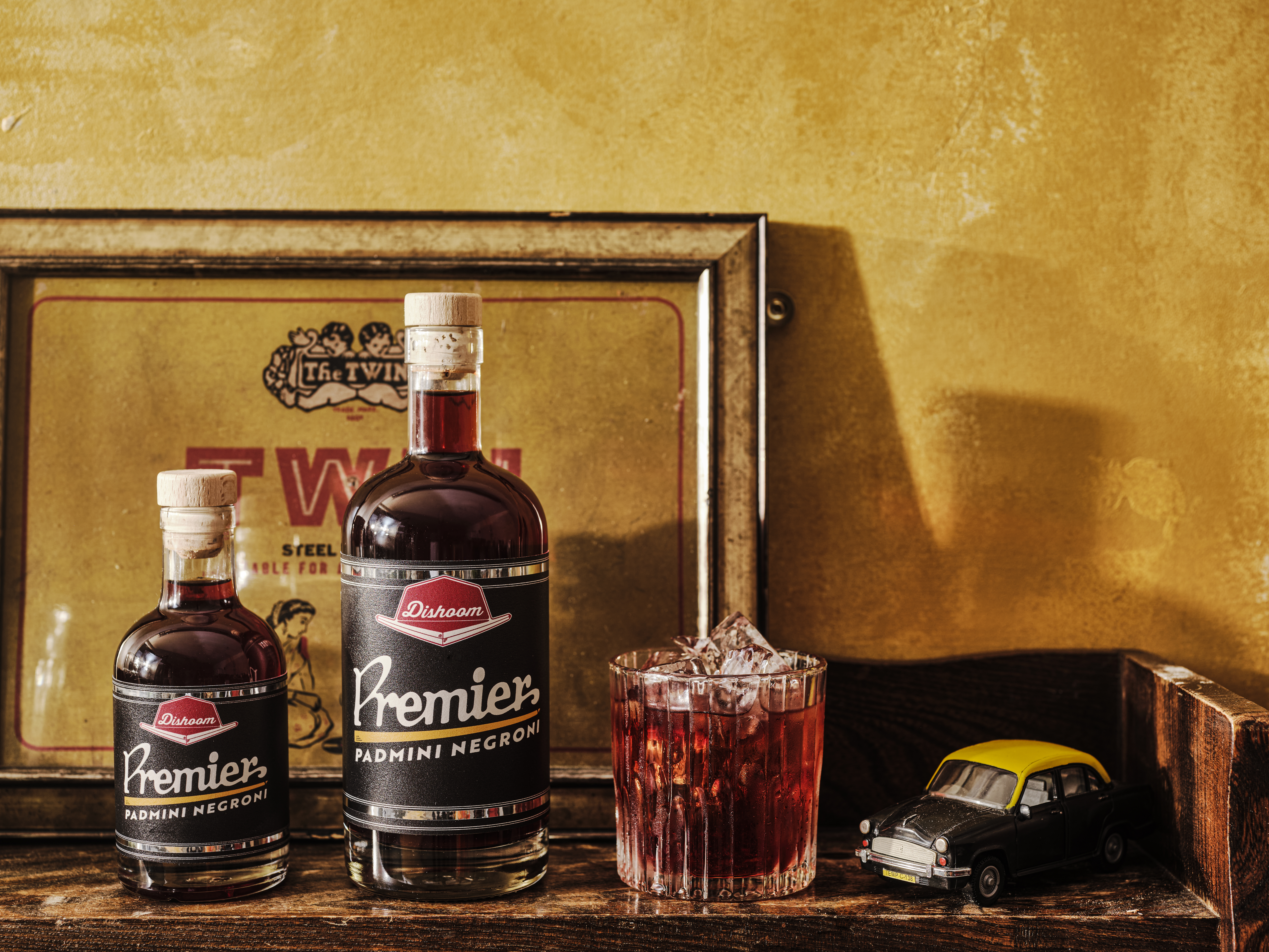
The Premier Padmini Negroni cocktail is a blend of Indian cocoa and sweet pears mixed in with the traditional Italian
cocktail. The cocktail label is a riff on the black and yellow Premier Padmini taxi cabs that were seen in Bombay in the 1970s and 80s. The typography on the label is inspired by the original logo on the Premier Padmini with some foiling. The chrome band around the side of the taxi is replicated on the label.

Sutton explains: ‘Taxis in Bombay are just Premier Padmini, which is a Fiat car. So, there are these Italian cars driving all
around Bombay and they’re super iconic. These taxis are black and yellow with loud roofs covered in mad wallpaper. And so, it’s a bit of a homage to that. Negroni is a classic Italian cocktail. And the twist is that it’s Italy in Bombay.’
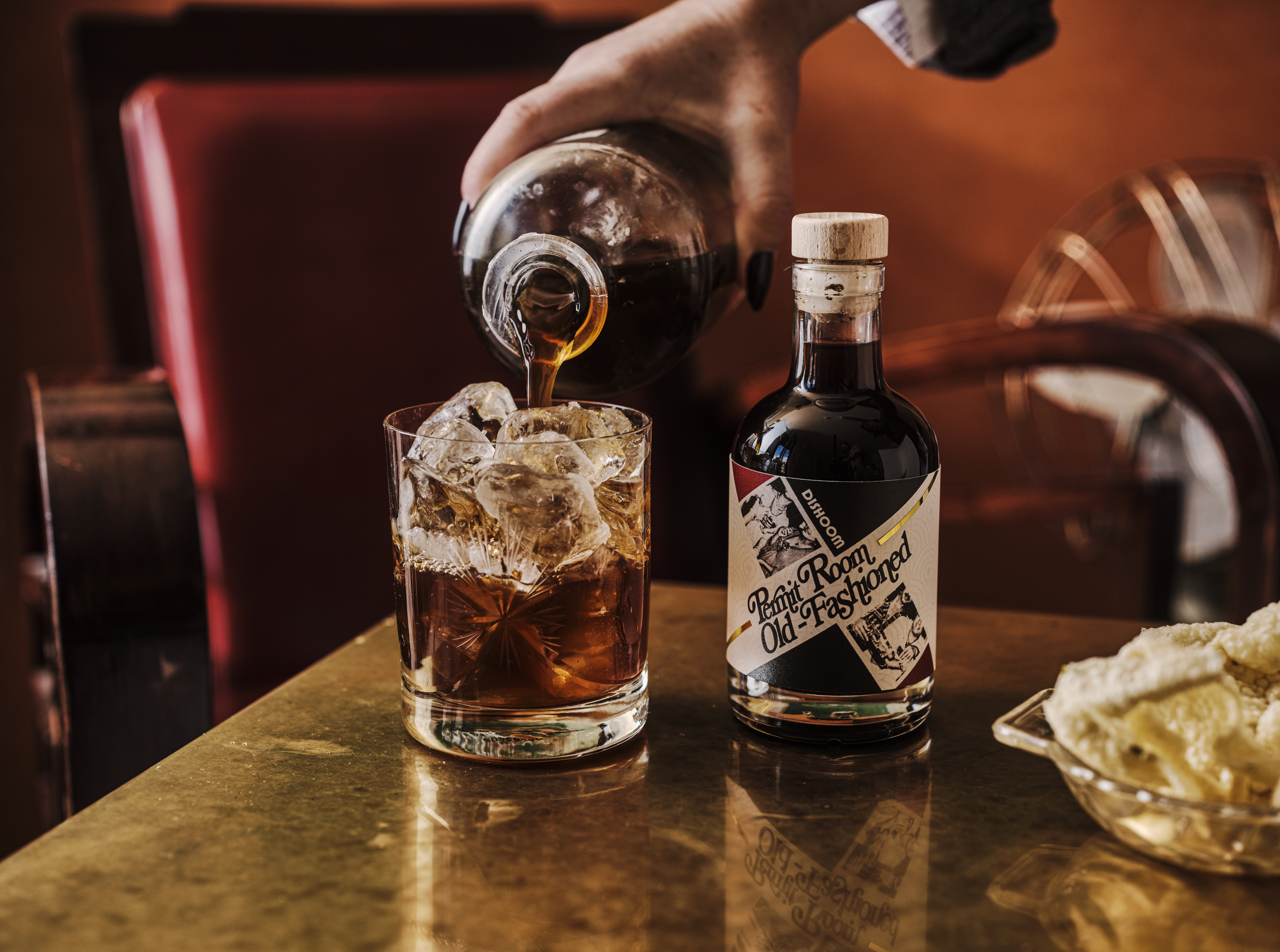
The Permit Room Old Fashioned is an old-fashioned classic whiskey drink. The label is inspired by the permit rooms in
Bombay where guests are required a license to drink liquor.
The label takes references from ‘oldfashioned’ Bollywood magazines featuring grainy images of celebrities at bars with drinks in their hands to bring out nostalgia and glamor associated with the time and drink. The thin gold strip across the label contrasts with the texture of the label material. The vintage typography ties the complete look together.

Sutton points out that the team originally designed cocktails labels that looked quite similar to each other in an Art Deco style, but later the design team opted for more variety with its cocktail label designs.
‘The similar label design for the cocktails didn’t bring enough personality to each of them, and so there wasn’t as much excitement around the cocktails when the labels were all so similar,’ Sutton says. ‘So that’s why we sort of went heavy with the storytelling on those. We did a refresh and I
think since then there’s been a much better response. And they sort of stand-alone as drinks.’
The brand will be expanding its cocktail range in the future.
Chutneys and spreads
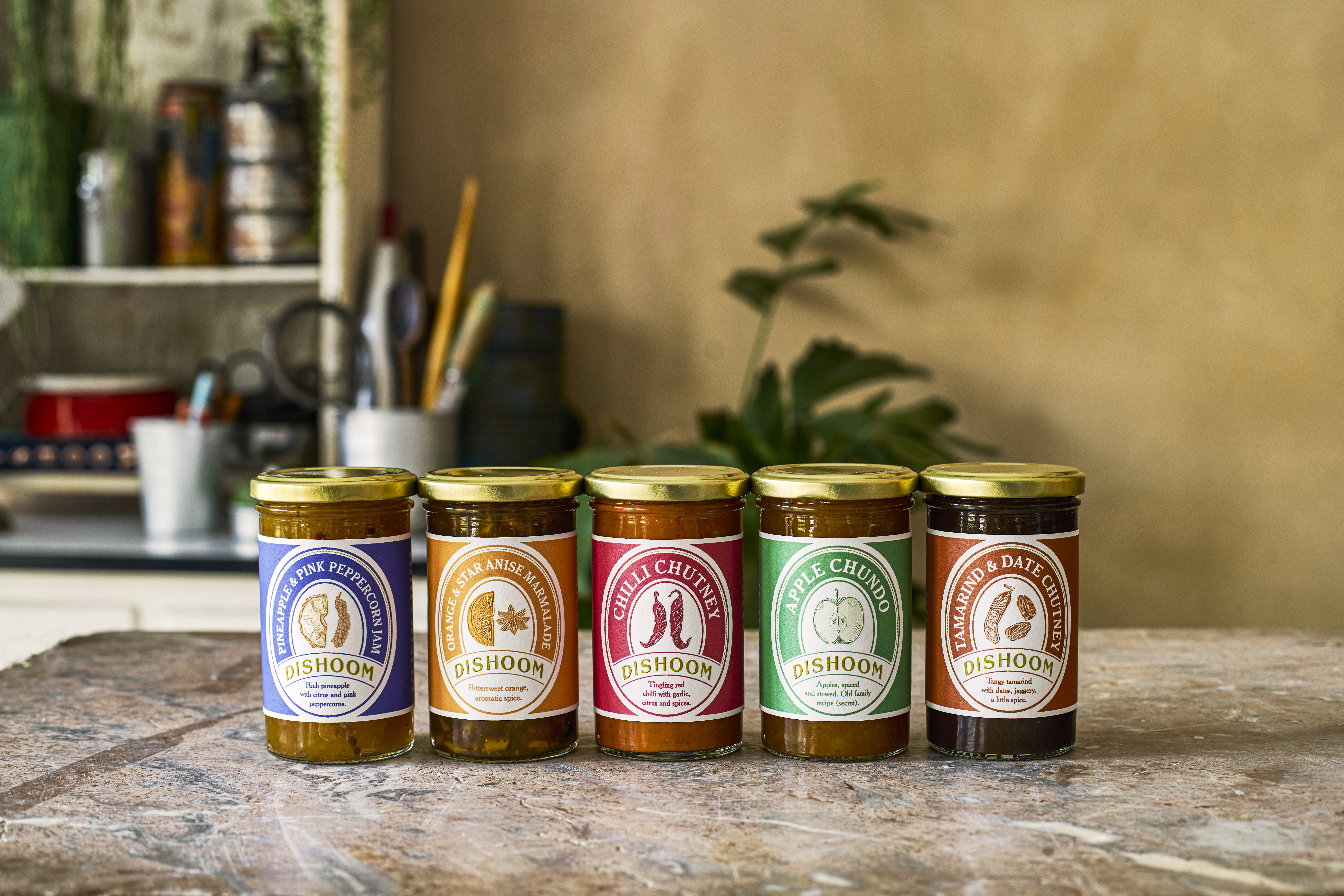
Dishoom chutneys and spreads are a range of recipes developed by the brand’s in-house chef. The products feature matching labels in different colors in minimalist vintage design – staying true to the brand’s design philosophy.

‘We like to imagine odd little stories (to design labels),’ Sutton says. ‘For this, we imagined a charming little produce shop somewhere on the corner of Bombay. So if you’ve seen the movie The Grand Budapest Hotel, there’s the cake shop Mendels. In the movie, Mendels has these
beautiful cake boxes, and it conjures a sense of this romantic store. This is our version of that to take you to that
romantic place.’
Just like the cocktails, the labels carry a hint of gold through foiling on the Dishoom logo and outline around the imagery.
Dishoom ‘Masala Dabba’
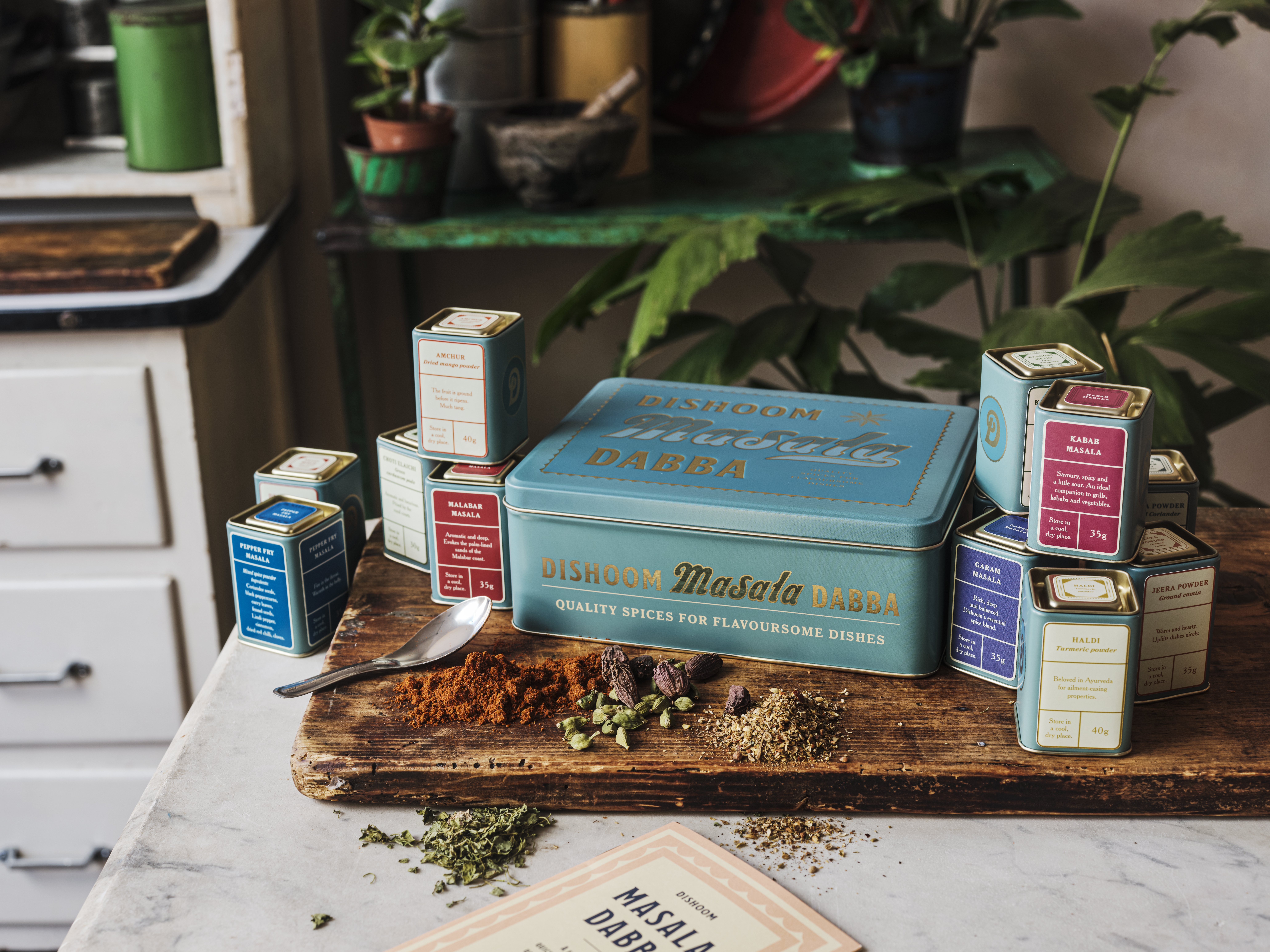
The Dishoom spice tin contains specialist blends from their chefs, such as kebab masala, and hard-to-find spices. The
spice tin is designed to be a keepsake, and customers can order refills from their store. The design of the spice tin
riffs off old Indian tea tins, which adds to the nostalgia factor. The ‘masala dabba’ features smaller tin boxes inside printed on top and the side in a minimalist design accompanied by a cookbook.

‘You put your old buttons in the box or you put your sewing kit after you are done using it. The idea of designing something to not just house the product but to carry on for people to reuse and to stay in their homes and that way you sort of become a part of somebody’s home. And it’s lovely if your logo is around somebody’s home for the next 10 years, of course!’ Sutton says.
The brand outsources its printing services and works with large suppliers in London. The choice of labelstock is
carefully made to create a premium and luxurious feel.
‘The label didn’t have to have the scalloped edge like that. It could just be straight and be cheaper to make. But it adds a little touch and sort of differentiates you. And we don’t typically use gloss paper. It’s almost always uncoated. Because it’s got that nice bit of texture. And I love a bit of foiling,’ Sutton adds.
Dishoom labels are often long runs, but the brand also does short-run labels for limited edition products. The brand has an internal product development and legal team to ensure the labels and packaging are compliant with regulations and supply chain requirements before choosing materials and finishes.
Stay up to date
Subscribe to the free Label News newsletter and receive the latest content every week. We'll never share your email address.


