Doghouse Distillery spirit labels inspired by music
London-based grain distillery, founded by husband and wife Braden and Katherine Saunders in 2017, is a mix of two of their passions – music and spirits

The complete range of Doghouse Distillery spirits
Braden Saunders shares how his love for music inspired the captivating label designs for four of the brand’s popular spirits.
Stepping into the Doghouse office in Battersea, London is akin to walking into a music festival or a recording studio. Every inch of the office walls is covered with iconic posters spanning across rock’n’roll to hip hop genres. At first sight, it’s clear that Doghouse is deeply inspired by the world of music. The distillery is claimed to be the only one in London that produces a multi-category of spirits from scratch.
Saunders says: ‘When we started the business, we knew we were about to do something quite out there. One of
the things that we have always loved is music. In fact, you tend to be drinking and listening to music or listening to music and drinking, they tend to go together.’
He continues: ‘And we were just thinking, where are we going to get inspiration for our labels? And we asked ourselves, what do we love? Music and booze. It was just a natural fit. Each of our spirit brands is inspired by a particular genre of music.’
Doghouse is a place of creativity and passion where music and cocktails converge into a harmonious blend of joyful
moments. The team at Doghouse firmly believes that every sip of its crafted spirits is accompanied by a unique vibe.
Saunders describes the brand’s spirits as its own form of music. ‘We consider ourselves artists in the world of spirit
creation. Spirit brands are our music, and our labels become album covers.’
Baller vodka

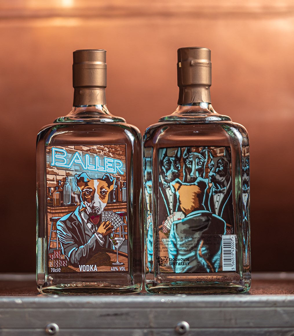
Baller vodka is one of Saunders’ favorite labels. The label portrays a suave Jack Russell Terrier, accompanied by a martini and a hand of playing cards. What sets this label apart is its dual-sided print: when the bottle is turned around, the terrier is seen engaging in a poker game with a
group of Dobermans, a larger breed of dog, confidently holding a royal flush.
Saunders elaborates: ‘He is beating the Dobermans at poker. The idea is that he is the little dog beating a bunch of big dogs. And that is reflective of who we are in the market. We are a little distillery, we are up against massive vodka brands. Hence, he is the underdog and we wanted to depict that.’
The art style chosen is pop comic which was invented in the 1950s and was repopularized with the advent of modern art.
The Doghouse team is particularly fond of rap and hip-hop music. Saunders notes that many early hip-hop artists emerged from challenging backgrounds, in the late 80s driven by their unwavering passion for music. This group of musicians has been a significant source of inspiration.
‘Most of it [music] came out of the American culture and the artists went from nothing to famous personalities. Because
we started thinking about hip-hop artists and where they are from, the first thing that popped into our heads, art-wise, was graffiti. Graffiti was synonymous with lower socioeconomic areas, and we wanted to capture that. And so that style of art stuck in our heads. Today graffiti has evolved to be called street art which is now more widely accepted.’
The world changed as graffiti artists garnered respect and recognition and ‘Pop Comic’ emerged as an art style. The
team conceptualized the label design and approached an artist in Sydney to bring it to life.
The Chilli Bacon variant of the vodka differs in flavor and hence has a slightly different design. Beside the Jack Russell, a Bloody Mary cocktail can be seen, and the
label’s color palette shifts to red hues to mirror the drink’s flavor. The brand worked with distinct artists for each of its labels. For this drink, the Jack Russell holds four aces in place of the royal flush on the back of the label. The brand plans to add to its range of flavored vodkas which will carry a similar label design concept.
Renegade gin

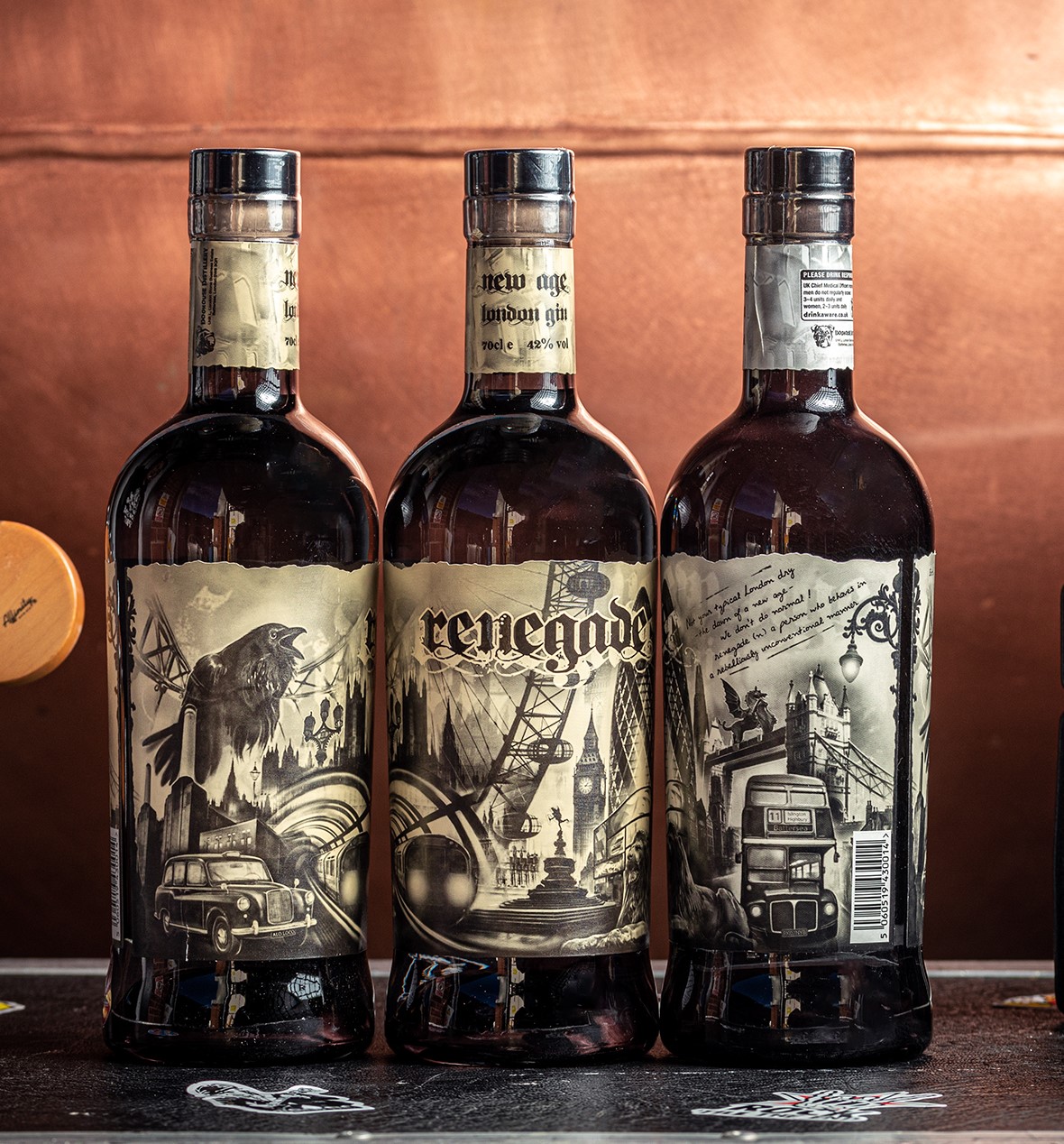
Renegade is Doghouse’s brand of gin. The bottle features a wraparound label with a slit at the two ends.
The label shows the old and new world iconic sites of London in an amalgamation of monochrome sketches and texts that run throughout its length.
‘This gin is inspired by rock and roll. We are old school, we like instruments. When we came up with this label, we looked at the gin market and thought, do you know what? They all looked the same – traditional and pretty-looking labels. But we wanted to do something different and fresh,’ Saunders says.
‘When you go to a rock concert, the first thing you do is get a drink. And then you go into the crowd, and everyone is just having fun. People are dressed however they like and have their hair however they like and nobody cares. It is not about looking pretty.’
He points out the symbiotic relationship between tattoos and rock music. To infuse this spirit into the gin’s identity, Doghouse collaborated with a tattoo artist from North London to create the label’s design. The black and gray visuals mirror tattoo illustrations. ‘I went in and asked him to do the label based on the concept. I still have the piece of paper of the label concept. It is an A4 landscape sheet with various icons of London and the River Thames running
through it. And I gave that to the artist and said: “imagine that I wanted something like this on my upper arm all the way around as a sleeve”. And that’s what he came up with,’ he reminisces.
The label shows Battersea power station, London cab, Clapham tube station, Westminster, Waterloo, London Eye,
Piccadilly Circus, Big Ben, Trafalgar Square, the cityscape, the Gherkin, the Shard at London Bridge and then to Tower Bridge. The split where the ends of the label meet is intentional to show the remaining liquid in the bottle. The edges on both sides are meticulously designed to resemble
London lamp posts.
The distillery calls Renegade a new-age version of the gin that’s been around for centuries. The side of the label says ‘Not your typical London dry – the dawn of a new age – we don’t do normal!’ The label also has the definition of a Renegade, a person who behaves in a rebelliously unconventional manner.
Doppelgänger aperitivo

The brand’s aperitivo is composed of an amalgamation of 19 botanicals to create a citrus-forward, fruity yet bittersweet concoction.
Drawing inspiration from house and dance music, the drink is meant to be consumed during leisurely afternoons as the day winds down. This drink is tailor-made for relaxation.
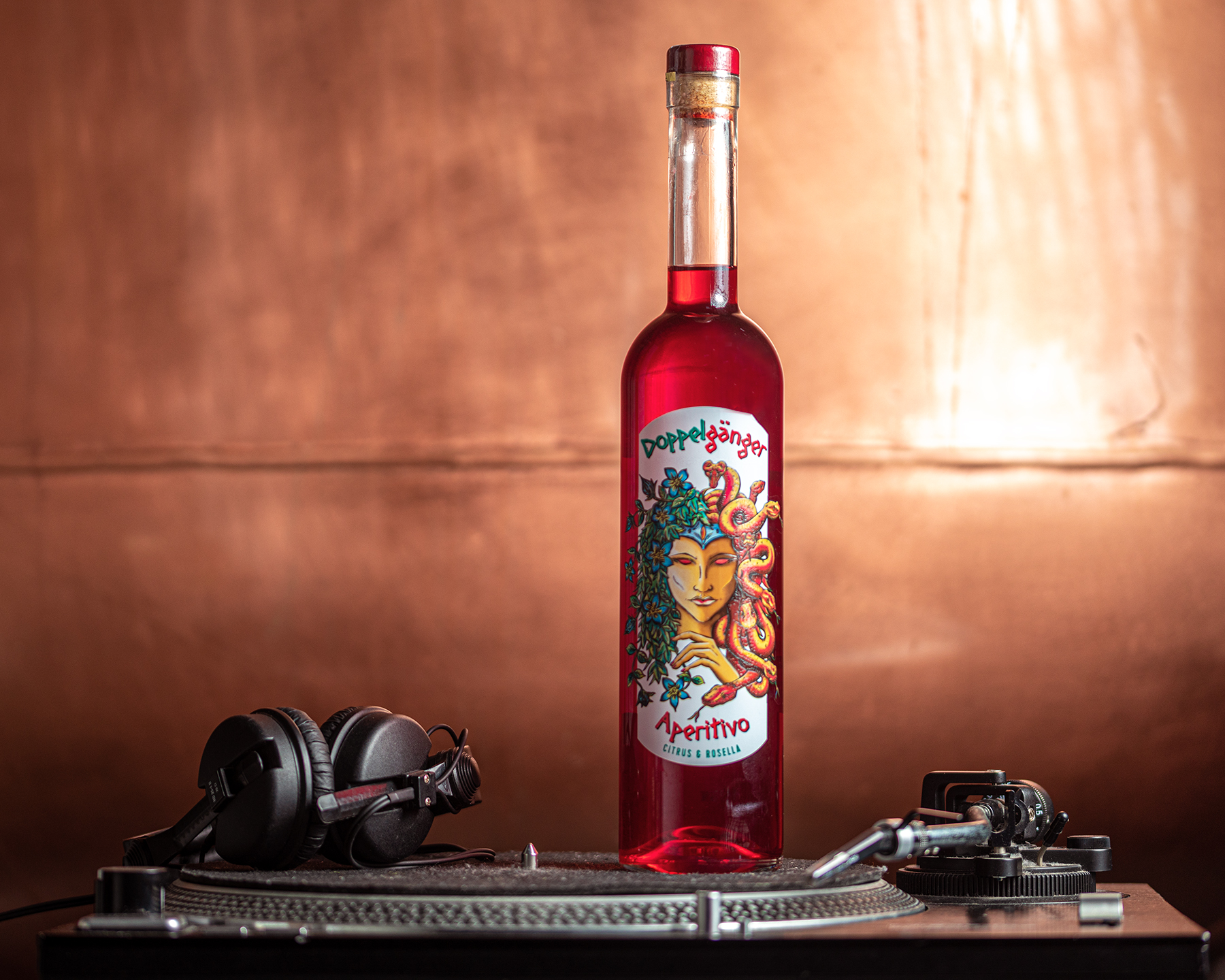
Employing a fantasy art style, the label for Doppelgänger takes a unique approach. It showcases an illustration portraying two halves of a goddess’ face.
‘One side is your good or light side, and the other side is your cheeky or darker side. Your doppelgänger is defined as a person on the planet that looks like you. And we have a saying that when you go out and have a big night, we blame it on the doppelgänger - it certainly wasn’t you!’ Saunders says.
Debt Collector whisky

Debt Collector is Doghouse’s whisky made from a mash of majority corn plus barley and rye. It is fermented using a Kentucky Bourbon yeast, copper pot distilled twice and then matured in a virgin American oak barrel before diluting to 50 percent ABV for bottling.
While the brand is modeled on a Bourbon, it is made outside of the USA and therefore, cannot be called a Bourbon.
Further, as its first releases are aged less than three years – the cut-off before it can be called a spirit whisky – the brand calls the initial two releases ‘moonshine’, taking inspiration from the origins and evolution of the category.
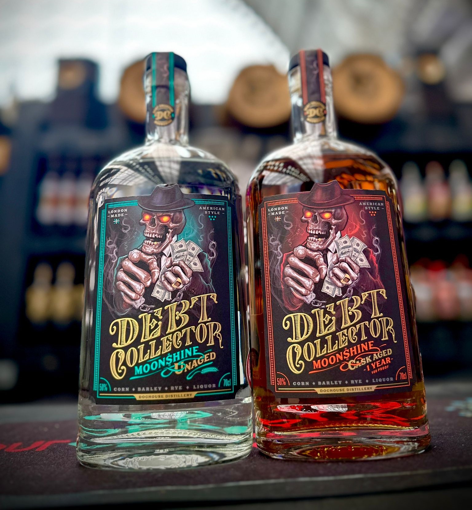
In true Doghouse fashion, the label turns heads. A fictitious skeleton gangster character, ‘Mad Dog Coll’ (created by a
German-based airbrush artist), reflects the Prohibition times that inspired the brand, where illicit alcohol - aka ‘moonshine’ - was born and bootlegging was rife.
Blues rock is the musical inspiration behind Debt Collector, and the label captures the essence of the Deep South of
the USA where Bourbon originated. One of the next steps in the brand’s evolution is to adjust its labels to maintain each spirit’s individuality but also align the different brands of spirits under the name Doghouse Distillery with its distinct logo on the bottles.
The brand’s converters use mostly flexo printing in combination with embossing, hot foil, acrylic gloss and layering for special effects. It also considers environmental
factors and labels and closures need to meet its sustainability standards before final sign-off. ‘We also give consideration for the substrate we use to provide an end appearance reflective of the style of art depicted on the label. It is a wholistic approach working backward from the end art piece,’ Saunders concludes.
Stay up to date
Subscribe to the free Label News newsletter and receive the latest content every week. We'll never share your email address.


