Chemistry Gin blurs the line between science and nature
New Zealand based craft gin brand blurs the line between pragmatic science and the pure joy of a well-mixed drink
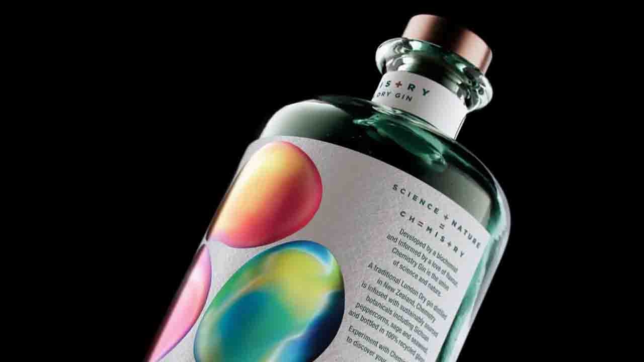
There's absolutely a science behind creating the perfect cocktail. A biochemist and her wife founded Chemistry Gin, and the packaging beautifully represents the scientific sentiment behind the ideal libation. The packaging, designed by SingleDouble, is clearly inspired by chemistry but isn't cliche in execution, forming a bottle that emulates the extraordinary elements of science.
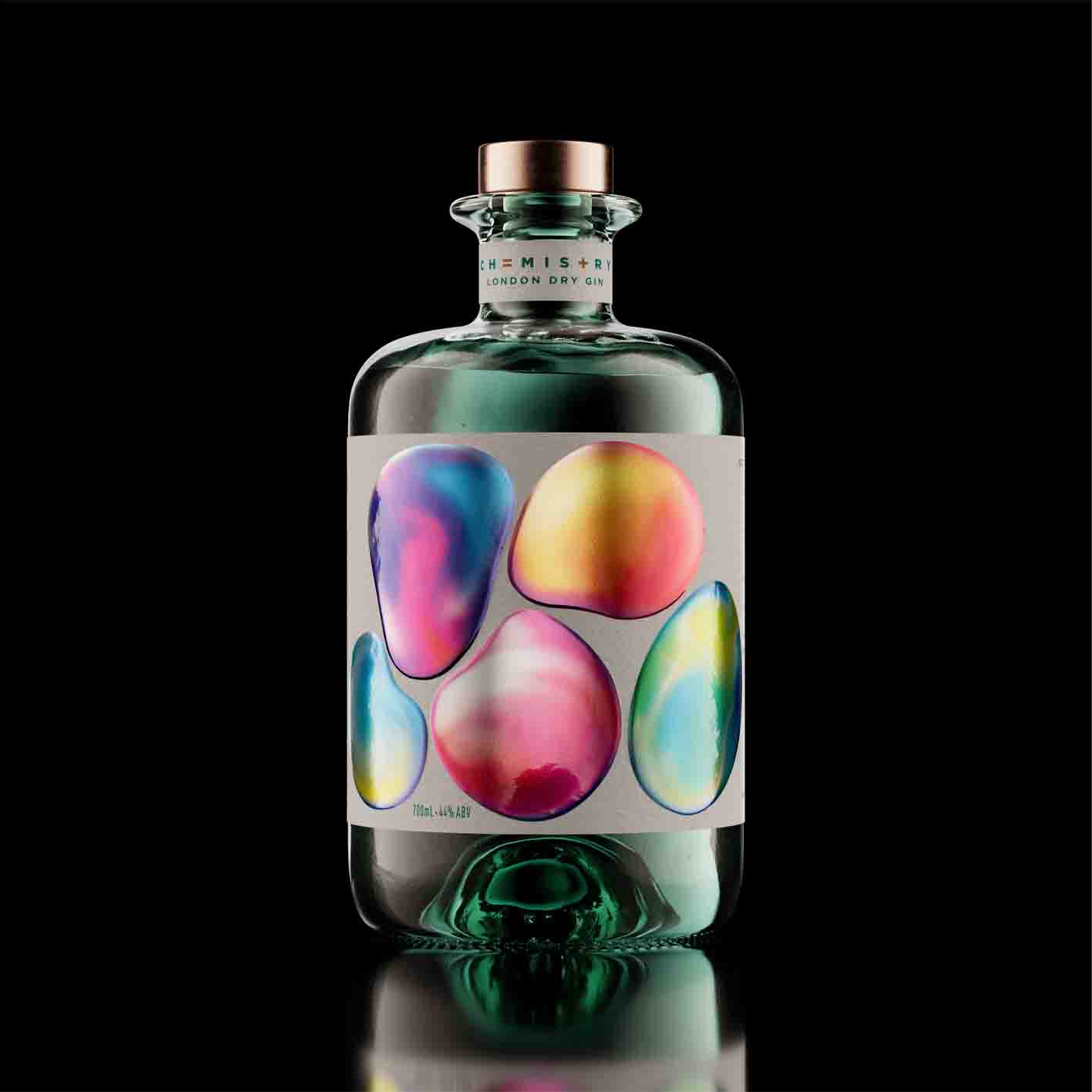
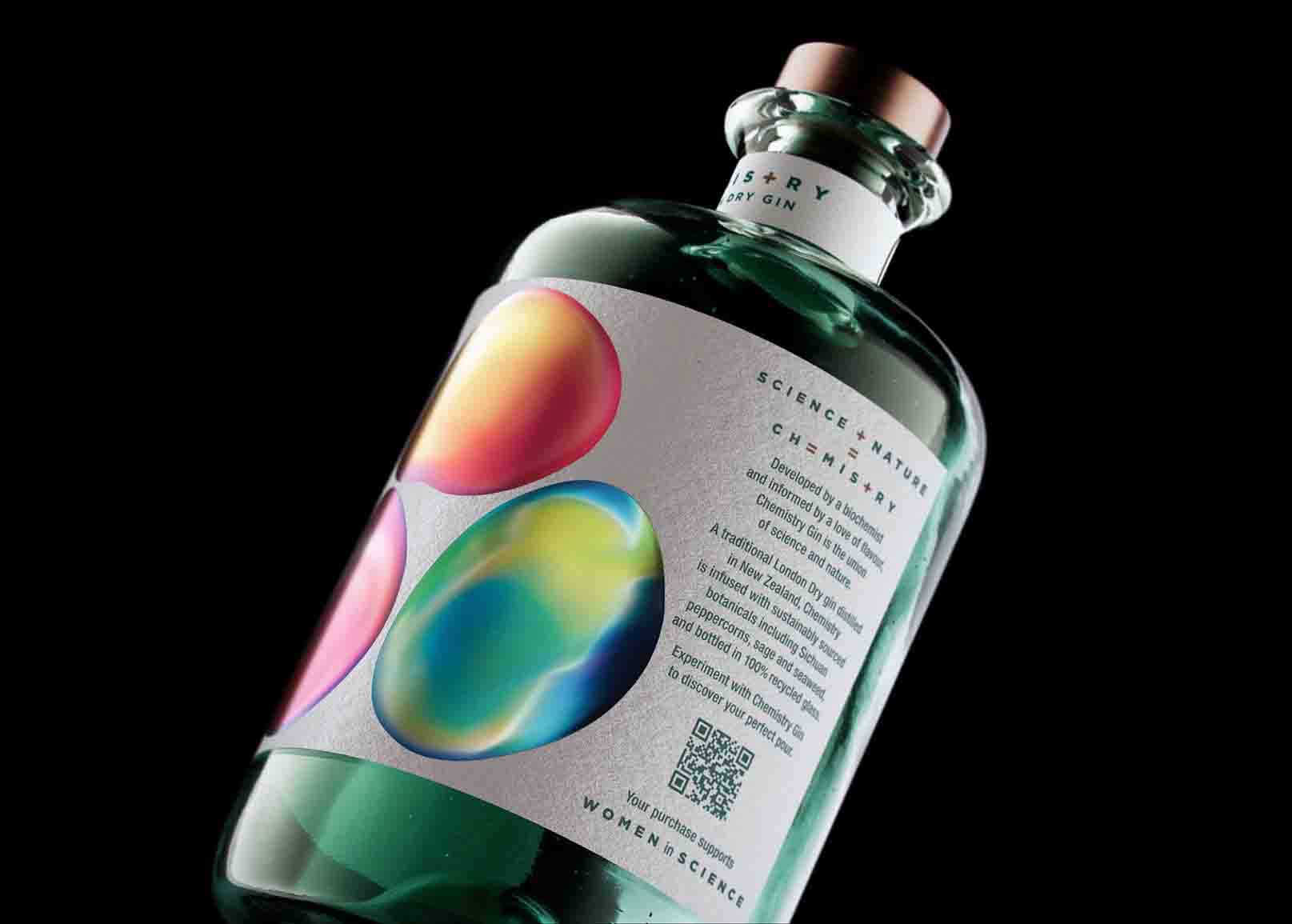
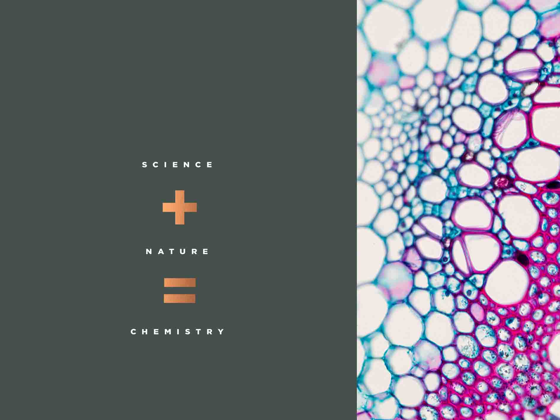
Chemistry Gin set out to explore the unexpected, a fresh take on craft spirits that blurs the line between pragmatic science and the pure joy of a well-mixed drink. Therefore, finding unexpected links between science, nature, and experimentation were essential elements in our design process.
Conscious of avoiding any obvious chemistry lab clichés, the designers worked to a theme of enhancing and elevating the creative, slightly wonderous side of science. They wanted to devise a highly engaging look with a dash of intrigue, linking chemistry to relationships between people and nature. The team developed abstract orbs to portray this organic interconnectedness, the shapes and colors morphing and blending into each other like polished stones or floating bubbles.
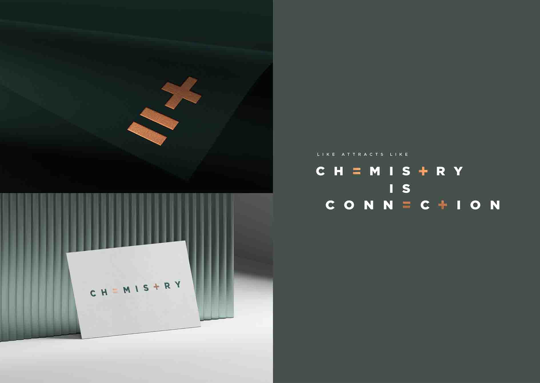
Overprinting on silver foil and adding a high build element to each orb lends a sense of subtle appeal and a tactile finish. Sustainability was an important concern, so the brand used a 100 percent Estal Pharma Wild Glass recycled bottle with 100 percent cotton uncoated paper stock. Chemistry is a Wellington based gin brand taking chemistry beyond literal science to the deep human connections that enhance our lives.
Created by a biochemist and her wife, Chemistry has a vision to donate a portion of all profits to support women in science. The end result is a product with a confident, lighthearted feel that embraces experimentation and is designed to surprise people, and draw them in with the use of organic, abstract forms. An aesthetic and approach designed to help a new brand stand out and thrive in the crowded craft gin category.
The label design won third place in Clear Spirits category of Dieline Awards 2023.
This article was sourced from Dieline and published with permission.
Stay up to date
Subscribe to the free Label News newsletter and receive the latest content every week. We'll never share your email address.

