Graphia Wines explores craftsmanship through label design
Conceptual wine bottle design deeply inspired by the art of typography and printmaking
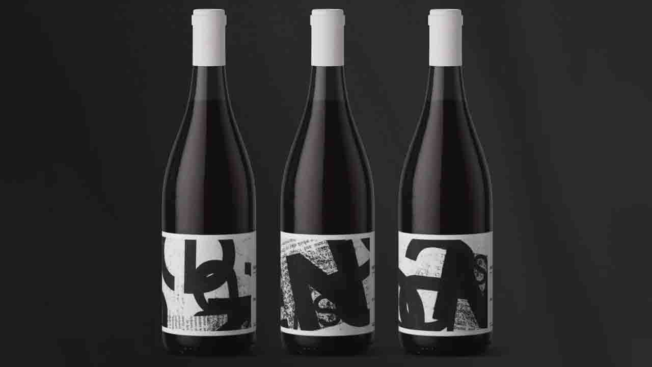
Deeply inspired by the art of typography and printmaking, Graphia is a conceptual wine bottle design that tests the limits of label design. The composition and range of found materials create an underlying sense of craftsmanship, adding an heir of creativity to the design. And while the label is exploitative, the color palette remains black and white, balancing the level of craft with a sense of refinement.
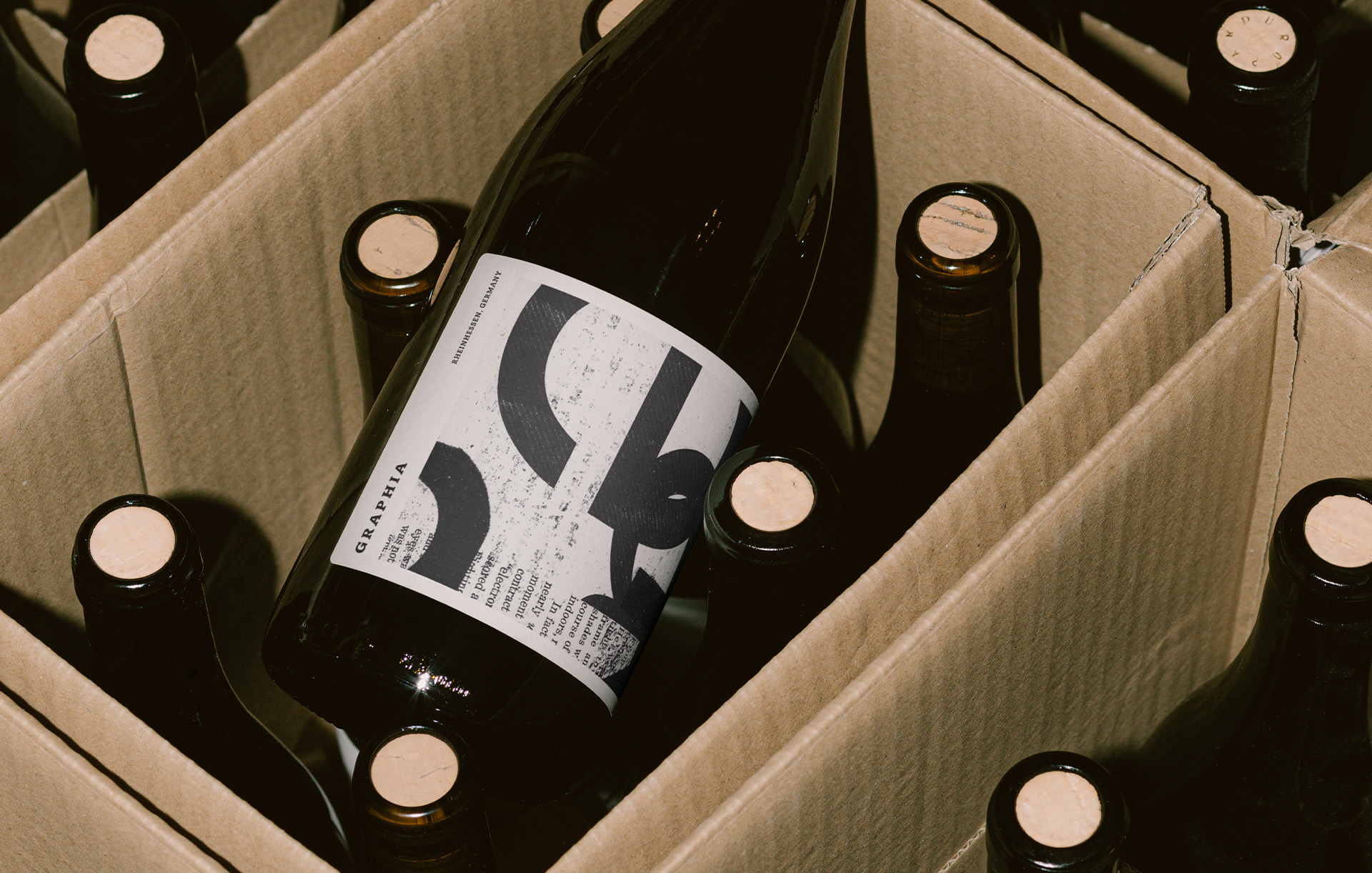
Graphia, which means 'to write' in Greek, is a self initiated project for a collection of artisan wine label designs inspired by my love for typography and printmaking. The designs combine the artistic elements of handmade collages, typography and silkscreen prints to create a visually striking and unique label series, with subtle hints that pay homage to the typographic world.
The handmade collages serve as the foundation to this wine label design. The collage includes the composition of various materials, such as paper, photographs and found objects that combine together to create a cohesive visual narrative. The presence of hand-cut or torn edges, unevenly applied adhesive and subtle irregularities add a sense of craftsmanship, authenticity and uniqueness to each label.
These imperfections further enhance the tactile and artistic qualities of the overall design whilst evoking a sense of creativity through each contrasting element. Typography plays a crucial role, acting as a bridge between the handmade collage elements and the necessary textual information. The careful selection of typefaces, styles and arrangements ensures that the typography harmonizes with the overall aesthetic, while maintaining legibility. The strict use of black and white is a classic color combination that is often used in printmaking.
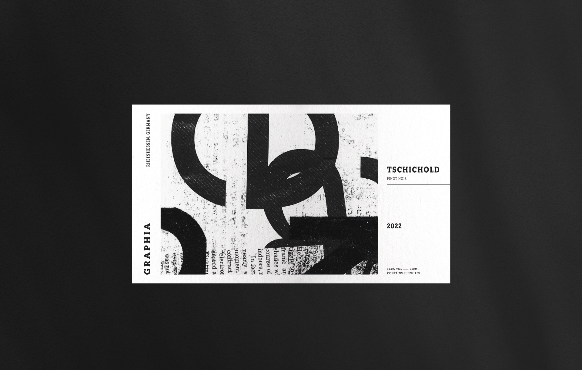
The black and white color palette creates a sense of simplicity and elegance but also allows the typographic collage to be the focal point of the label. While inspired by typography and traditional printmaking techniques, the wine label design also incorporates modern design sensibilities to ensure its relevance in today's market. The fusion of traditional printmaking techniques mixed with contemporary typefaces establishes a balance between tradition and innovation, appealing to both traditional wine enthusiasts and younger, design-conscious audiences.
This article was sourced from the Dieline and is published with permission.
Stay up to date
Subscribe to the free Label News newsletter and receive the latest content every week. We'll never share your email address.
