Neuromarketing study reveals insight for gin label design
UPM Raflatac’s Ginnasium project blends science and art, using neuromarketing to assess how consumers react to gin packaging design.
An avant-garde venture, sponsored by UPM Raflatac, brings together design experts, bottle and label manufacturers, embellishment artisans, printing specialists, closure craftsmen and neuromarketing pioneers to understand consumer preferences.
The Ginnasium project focuses on educating stakeholders in the packaging supply chain about the importance of design choices on the final product’s effectiveness. Ginnasium employs a scientific approach to analyze consumer experiences with gin bottles, exploring different design elements such as bottle shapes, closures, papers, embellishments, printing techniques and inks.
The project aims to understand how these elements capture consumer attention on the shelf and emotionally convey the
product’s identity. The SenseCatch method, using neuromarketing methodologies, was used to discover unconscious and emotional aspects of consumer behavior. Additionally, in-depth interviews were conducted to understand consumer opinions, expectations and message
interpretation.

UPM Raflatac provided for the project Forest PP Clear TC 50 wood-based film, Genesi WSA-FSC textured white paper,
Aluflex Premium triple-layer aluminum foil, Jazz Ice Premium FSC white paper with debossed texture barrier-coated in the pulp and Cotton Black WSA 100 percent black cotton paper.
Printing specialist Sovemec used multiple printing techniques for the project including flexo varnishing, hot foil colors, cast and cure laminations, embossing matte/glossy screen printing, a label-on-label application using two different papers, special
die-cutting methods, embossing, debossing, paper texture, sand-textured varnishes and waterless offset printing.
Glass bottles were provided by Vetroelite and Vinolok supplied glass closures for the project. Luxoro provided its metallic and holographic foils, semi-transparent and translucent effect films by Kurz and brass stamping tools by Hinderer + Mühlich Italia. T&K provided UV 171 UT series of waterless printing inks specially crafted for the label industry and Terragloss UV matte varnish by Actega formulated to be over-printable and benzophenone-free for label applications.
SenseCatch is a research and consulting company specializing in applying neuroscience and behavioral psychology to measure marketing effectiveness and consumer experiences.
The project
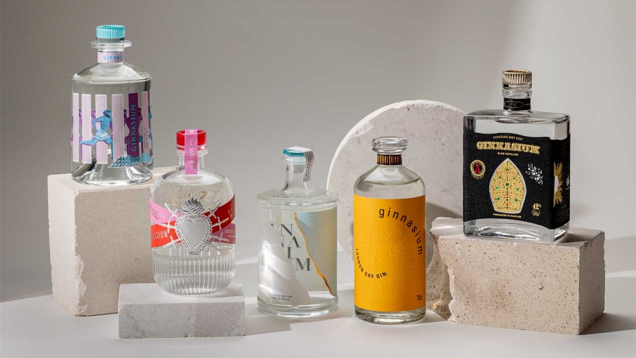
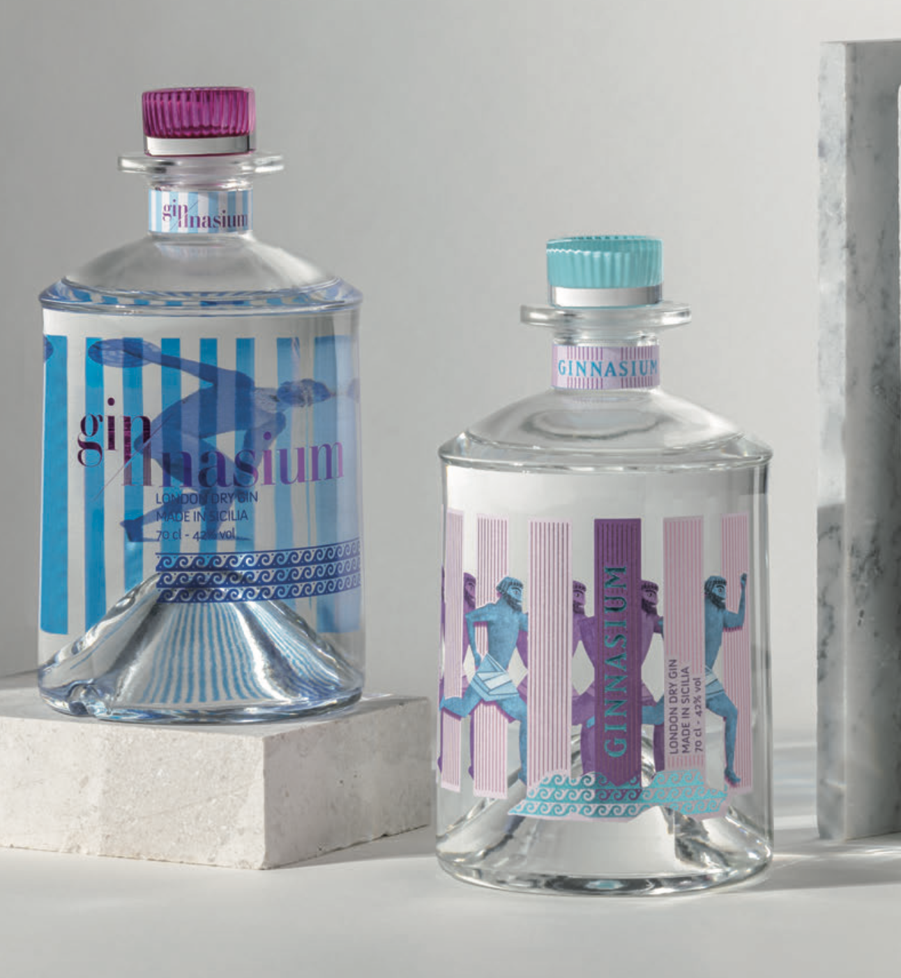
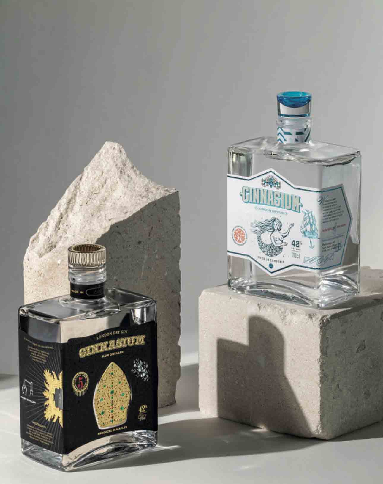
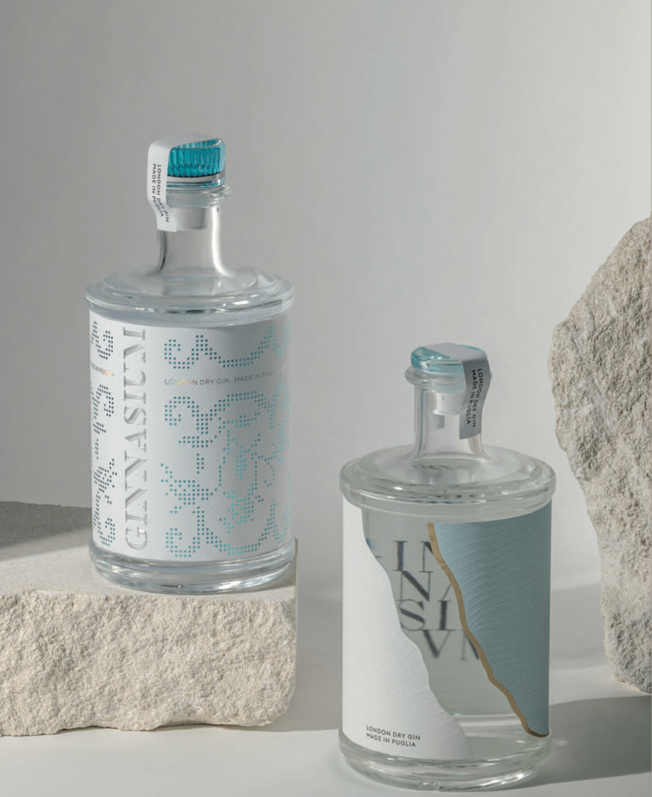
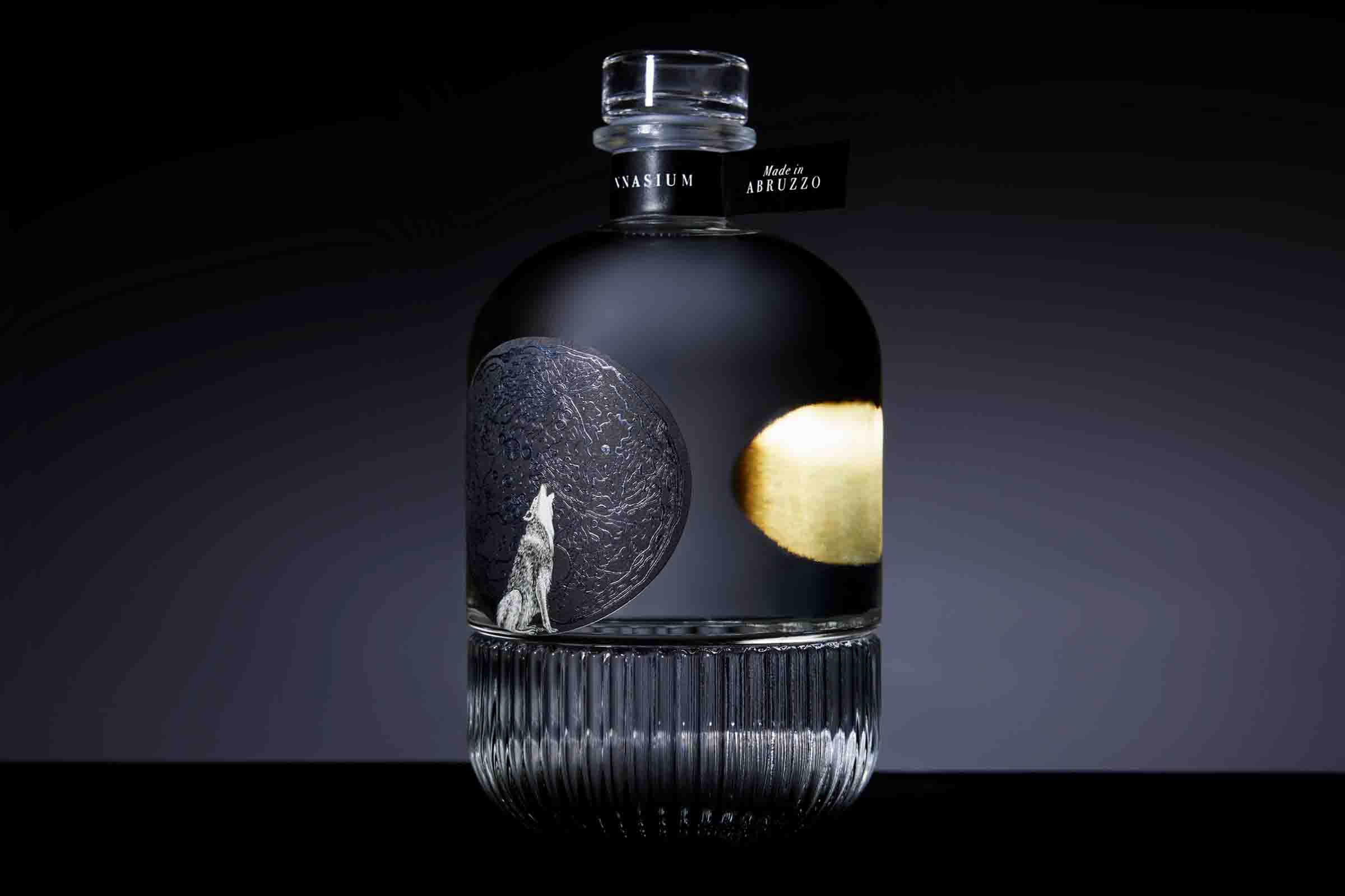
Five designers from Southern Italy including Leonardo Recalcati, Marco D’Aroma, Silvia Cacace, Gianluca Bartolazzi, Andrea Basile, Giuseppe Salerno and Flavio Sisto took part in the project to create unique designs for gin bottles. Each designer represented the essence of their respective regions. They were provided with bottles, glass closures, paper and options for enhancements, inks and printing techniques. Their challenge was to artistically convey their regions’ characteristics while staying true to the brief, which intentionally omitted any information about the gin’s taste. This allowed the designers complete freedom
in their design.
Recalcati says: ‘I chose to participate in Ginnasium, the gym for gin design, because it is interesting to discover, through SenseCatch’s work, if my thinking is shared and evokes emotions.’
‘Ginnasium has been a project that captured our hearts from the beginning. Being able to narrate our land through a label was a unique and rewarding experience that allowed us to express our creativity without limitations. The success of this project is also attributed to all the partners involved, who consistently supported our agency in achieving this excellent outcome,’ Sisto comments.
Consumers were asked to select bottles representing different Italian regions from a shelf where bottles of the same shape were placed alternately. They had 30 seconds to choose bottles for each region, followed by in-depth interviews. Participants could touch and inspect the bottles to appreciate their details visually and tactically. The study aimed to understand consumers’ perceptions of the designs and their emotional involvement using neuromarketing technologies such as eye-tracker, bio-tracker sensor and EEG headset.
D’Aroma states: ‘Ginnasium served as our experimental ground, allowing us to delve into new materials and printing techniques. Our focus centered on crafting premium packaging where details, textures, and enhancements form an integral part of the consumer experience. Our objective was to spotlight its distinctive characteristics and uniqueness.’
Study findings
Eye-tracking technology was used to analyze the designs’ ability to catch shoppers’ attention. The analysis revealed
that elements such as label color, shape contrasts, glossy enhancements, colored closures and raised finishes were particularly attention-grabbing.
The emotional involvement data indicated that designs with visual and tactile elements, such as contrasts and textures, effectively engage shoppers. This leads consumers to perceive the product as richer and more refined.
While sight initially attracts consumers, tactile sensations during the interaction enhance engagement.
Soft and velvety surfaces are appreciated, but the tactile experience must be consistent with the image a brand aims to
convey. Consumers appreciated textures and embellishments such as finishes resembling sand dunes, paper patterns
resembling waves, smooth closures evoking a seaside imagery and labels featuring textured and rough surfaces looking like fossils and mosaics evoking stone conveying a sense of naturalness and authenticity. Consistent engagement of sight and touch is crucial for emotional involvement and
perceived product value.
Closure
Closures play a crucial role in shaping consumer perception, with tall and vibrant closures capturing attention and conveying a specific message. While flat caps receive less initial attention, they are perceived as refined during physical interaction. Concave caps spark greater curiosity and preference compared to flat caps. Smooth closures are pleasing to the touch, but textured closures enhance the overall product experience.
Printing
Embossing and debossing printing techniques not only capture consumer attention visually but also through touch, creating a multisensory experience that allows consumers to assume the product’s characteristics before experiencing
it. The strategic use of metallic embellishments highlights the
product’s qualities and overall design.

Bottle
The shape of the bottle influences how embellishments are displayed. Square bottles enhance edge decorations and round bottles convey softness. Square bottles are associated with premium and assertive products, while round bottles suggest refinement and softness. The fusion of a round bottle shape with a poetic design evokes curiosity and conveys attention to detail and refinement through the blend of smooth and textured surfaces.
Graphic design
The harmonious blend of shapes, colors and materials reinforces the intended image and message. Dark colors on
angular bottles evoke heightened value and intensity, suggesting an intensely flavored product. Softer colors on rounded bottles create the perception of a smoother, refined gin, implying freshness. Colorful designs suggest a sweet, fruit-infused beverage. Both visual and tactile contrasts also
influence perception.
Paper
Glossy and embossed papers draw consumer attention to the bottle. Similarly, matte paper elevates the sophistication and uniqueness of the label, evoking a poetic and theatrical context. Dark papers with textured surfaces give the bottle character and convey an expectation of a rich, intense taste.
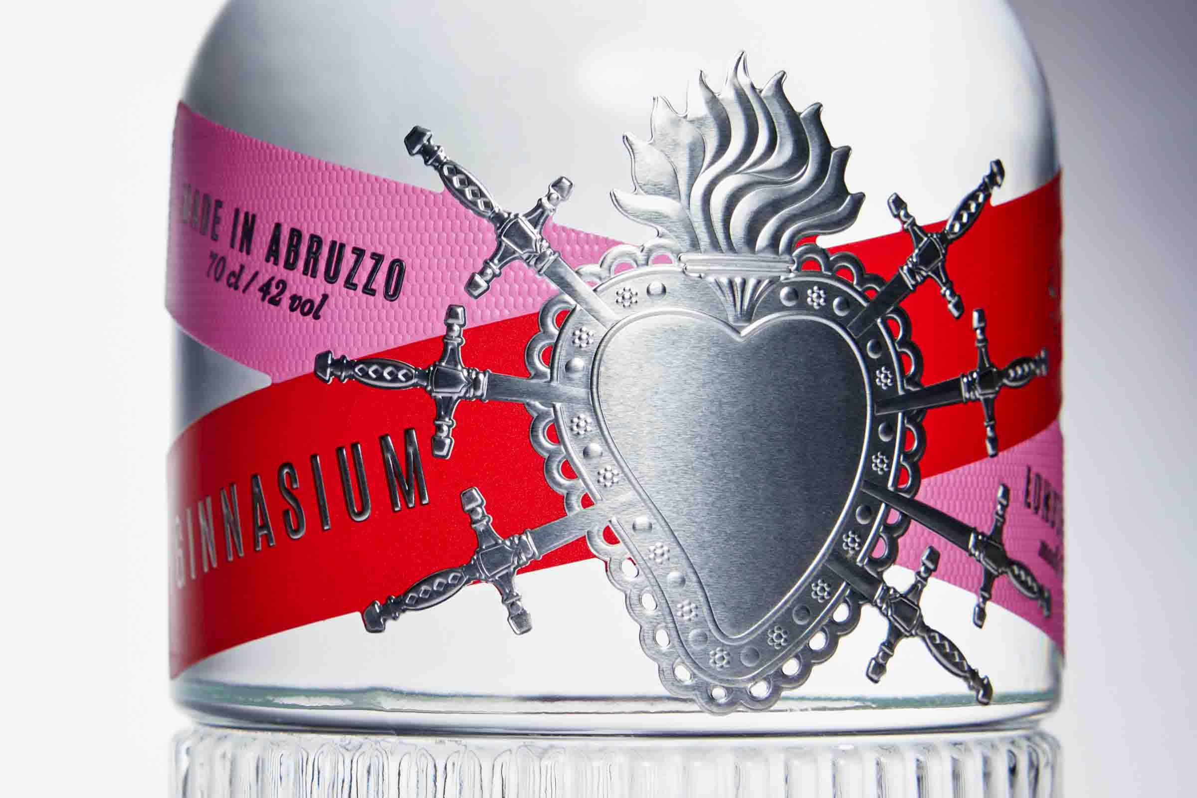
Strategic selection of packaging elements is vital for shelf appeal. Contrasting colors, shapes, glossy finishes and unique closures make the gin bottle visually striking. Unexpected tactile experiences increase engagement, enhancing the desire for the product. Golden details against textured papers convey elegance. Every detail communicates a message, shaping expectations about the product
and influencing consumer choices. Considering consumer psychology is crucial, as their attention to detail recognized in psychology as ‘weak signals’, can impact packaging success
and product perception.
Stay up to date
Subscribe to the free Label News newsletter and receive the latest content every week. We'll never share your email address.

