Shining the light on shady packaging
In her ever-popular #shadypackaging series, branding and design columnist Vicki Strull explores the good, the bad and the ugly when it comes to brand packaging and design.
I love packaging. That probably seems obvious, since I’ve been a packaging designer and design strategist specializing in print and packaging for almost three decades. But my obsession with packaging—the good, the bad, the absurd—goes beyond a professional relationship. I am always asking questions and sharing stories with my friends, colleagues and my package-fanatic followers. So, it was only natural that I shared online my story about being duped by a lettuce package.
I clearly remember the first time I bought this shredded iceberg for my family’s taco night. I only purchased one bag, because I thought it was a full bag. However, see that wide purple band? The bag is empty above that. That is an image of shredded lettuce, printed on the bag and making it appear that it is filled to the very top. Humph.
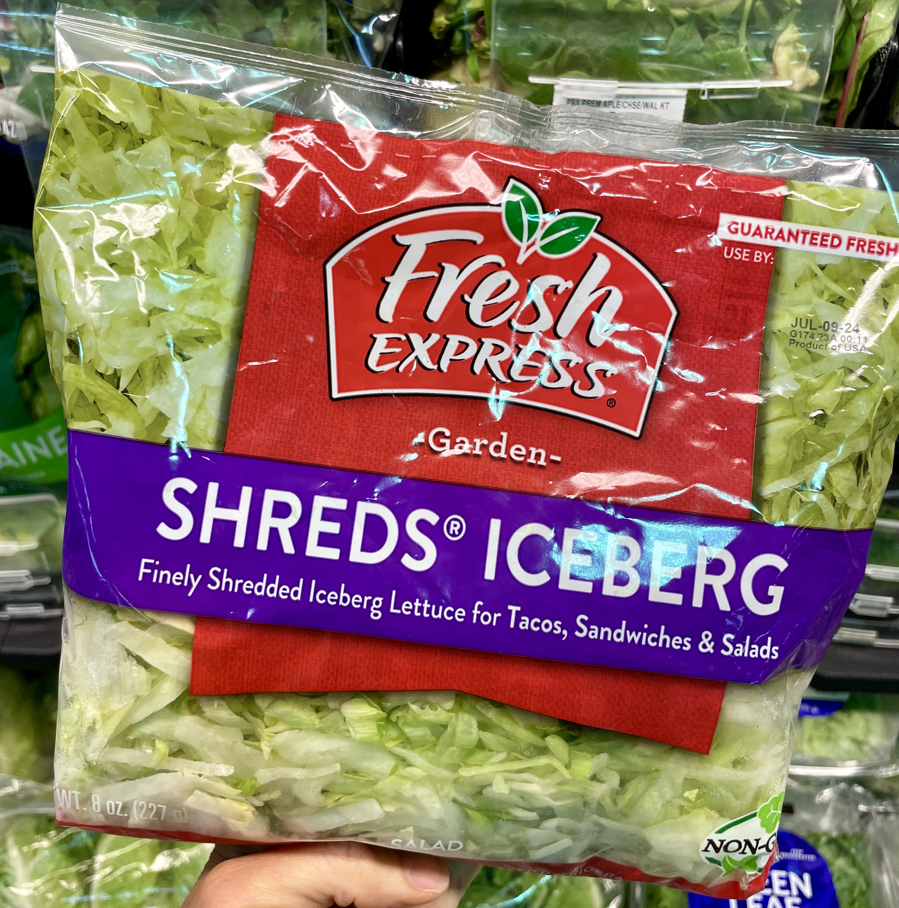
As a packaging designer, I get why Fresh Express did this. Better, more attractive shelf presence. And they did a good job of matching the photo of shredded lettuce to the actual shreds you can see at the bottom of the bag (which is clear film). But therein lies the dupe.
It’s not the most egregious design manipulation that I’ve seen, but I wonder how this might affect the brand’s sales
It’s not the most egregious design manipulation that I’ve seen, but I wonder how this might be affecting the brand’s same-store repeat sales. That metric would tell Fresh Express if it is losing trust and brand loyalty with this packaging design.
The birth of the #shadypackaging series
The overwhelming response to my lettuce story gave birth to my months-long LinkedIn series, which I call #shadypackaging. You know, the kind of packaging that intentionally misleads people into thinking something about
the product that isn’t true. Have you ever purchased something you thought was going to be one thing—based on the package, the image, the copy, whatever—and then you were sorely disappointed? That’s shady packaging. The topic has clearly struck a nerve. One #shadypackaging post has nearly 4 million impressions, 1,000 comments, almost 10,000 reactions and hundreds of reposts. I gotta say, it feels great when you realize you’re not alone in your obsession.
Following are a few more examples of #shadypackaging that garnered outrage, agreement, or in some cases, enlightened explanations.
Shady structure
There are different types of shady packaging. The lettuce packaging is shady printing. For this next example, I believe it is a shady structure.
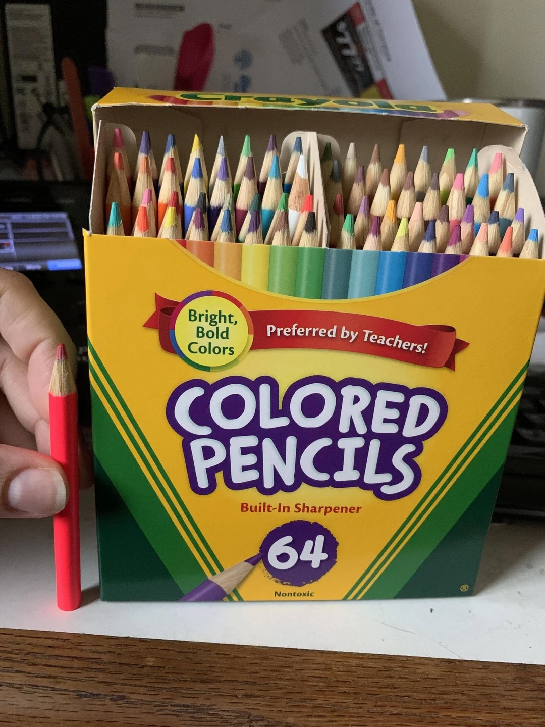
Consumers who bought the Crayola Colored Pencils thought the items were the length of a standard pencil because of the height of the box. When they took the pencils out of the box, they were disappointed to find that they were much shorter than expected. Was Crayola doing something sketchy here?
A lot of people said yes that this was designed to fool people. However, in the crafting community, the pro-Crayola group argued that Crayola is a children’s brand, and therefore, its colored pencils are made to fit children’s hands. Someone else said that the pencils are simply crayon-sized. What do you think? I honestly cannot decide. On the one hand, the packaging looks deceptive to me; on the other hand, I understand the child-size reasoning.
Packaging illusion
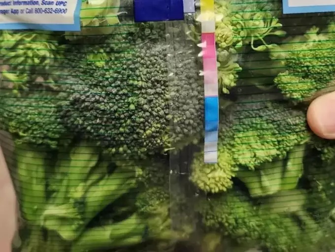
For our next example, let’s talk printing. Doesn’t this broccoli look fresh? I would likely purchase this item. So, what’s the hitch? Look closely. This packaging has printed green stripes on the clear film, creating an optical illusion to make the broccoli look like it’s a bright, crisp green. Compare the broccoli on the right of the middle seam with the broccoli on the left side, peeking through the packaging illusion. Doesn’t look as attractive, does it?
One follower commented: ‘Look at the seam in the zoomed-in photo, where the printed lines are not able to overlap. The broccoli looks vibrant under the stripes and graying when seen through the unprinted areas.’
Does this kind of optical illusion fair play in packaging? I don’t think so. Next time you’re shopping, I bet you’ll notice the tangerines in orange-colored net bags, the green beans in striped bags, and many other similar shadies.
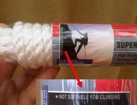
When shady becomes dangerous I suppose when you think about it, there are a lot of elements on packaging that aren’t true. The Keebler Elves don’t actually make the cookies. You don’t actually get a toucan with your Froot Loops (too bad). But this next example seems downright dangerous.
You can see that the image on the rope
packaging is a person mountain climbing with a safety rope. However, the copy on the package says: ‘Not suitable for climbing’.
What if a consumer goes by the image on this package and doesn’t see the written warning? If they use this rope for climbing, they could get severely injured. Is this shady packaging? Did the brand intentionally mislead people? I don’t know. But it is a complete discrepancy of image and copy and a really poor design choice. The brand clearly didn’t think this one through.
And then there’s ‘shrinkflation’
Another type of shady packaging falls under the category of ‘shrinkflation’—reducing the size or quantity of a product while the price remains the same. I knew my series was going mainstream when my 23-year-old son opened his bag of airline chips and exclaimed: ‘Are you kidding me? Mom, shady packaging alert!’
We counted: 12 chips. And not all of them were whole. Definitely not a satisfying snack.
The comments for this post were mostly humorous:
‘We thought ‘minis’ was a reference to the chip size. Turns out it’s the portion!’
‘Well, it’s an airline snack... they have to be careful about the cargo weight!’
‘Shrinkflation’ led to a conversation about another term in the industry: slack-fill. Functional slack-fill is good; it’s the airspace left in a package to protect the product. Non-functional slack-fill is bad. It makes it look like you’re getting more product than you are. In 2018, Kitchen Cabinet Kings tested 14 name-brand potato chips to measure the air-to-chip ratio in each bag. Then they crunched the numbers. (Sorry, I couldn’t help myself.) They found that the average amount of air in chip bags is 43 percent.
Do you trust that the amount of air in your chip bag is necessary?
Mom, shady packaging alert!
See if this educational comment helps you decide; I know it gave me a new perspective: ‘I was a PC [potato chip] packaging team leader at Frito Lay 13 years ago. Yes, there’s a ton of air and yes, it’s because of breakage. We obsessed over delivering the perfect chip. Imagine trying to take something incredibly more sensitive than paper and stuff it into cartons. Then stacking those boxes into big rigs. Then they have to go to distribution centers and onto smaller trucks and those drivers have to stock shelves. Quickly. So, you may ask, how did we know how many chips went in? It was by weight. Eight carefully calibrated hoppers with a vibrating platform on top worked together to find just the right combination of weight to drop into a bag.’
That response has given me an enormous amount of respect for fragile food packagers. Still, not everybody feels that way. A few months ago, I had to wonder if lawmakers were following my #shadypackaging series. The Shrinkflation Prevention Act was introduced on March 26, 2024.
If passed, it would prohibit corporations from deceptively decreasing the contents of their packaging without lowering the price proportionately. It will be interesting to see if this legislation goes through and has an impact on shady packaging practices.
Excessive Packaging
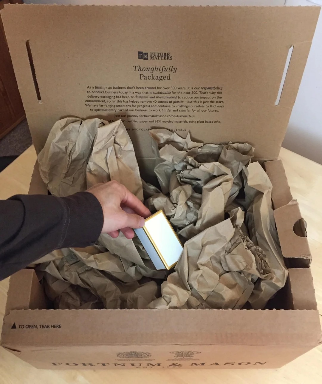
Next, my series led to a topic near and dear to my heart: the need for sustainability. For the series, I tagged it #excessivepackaging. Take a look at this example: Fortnum & Mason is committed to phasing out single-use plastic; currently 76 percent of its packaging is recyclable. Truly commendable.
But...
When your business sends a 2-inch item in a 17-inch box filled with filler, something is broken in your sustainability mission.
And it’s hard to resist poking fun when the box boldly states that the item has been ‘thoughtfully packaged’ to reduce impact on the environment.
I loved this comment from a wise follower: ‘This is why it is a good policy to order from your own company at least once a quarter. We were able to cut 40 percent of our packaging costs by working with the fulfillment team to identify areas to cut back on packaging size and packing.’
The other side
During my series, I realized I had neglected one of my absolute favorite categories. So I started #positivepackaging to highlight some of the great design and execution out there.
This product package from Neocutis is particularly outstanding because it’s so unusual in the cosmetic industry. Typically, when a bottle of cream or lotion is empty, I have to cut it open to extract the remaining product. (Who else does this?) However, when I cut open this eye cream, I was notably surprised by what I found: an empty interior container.
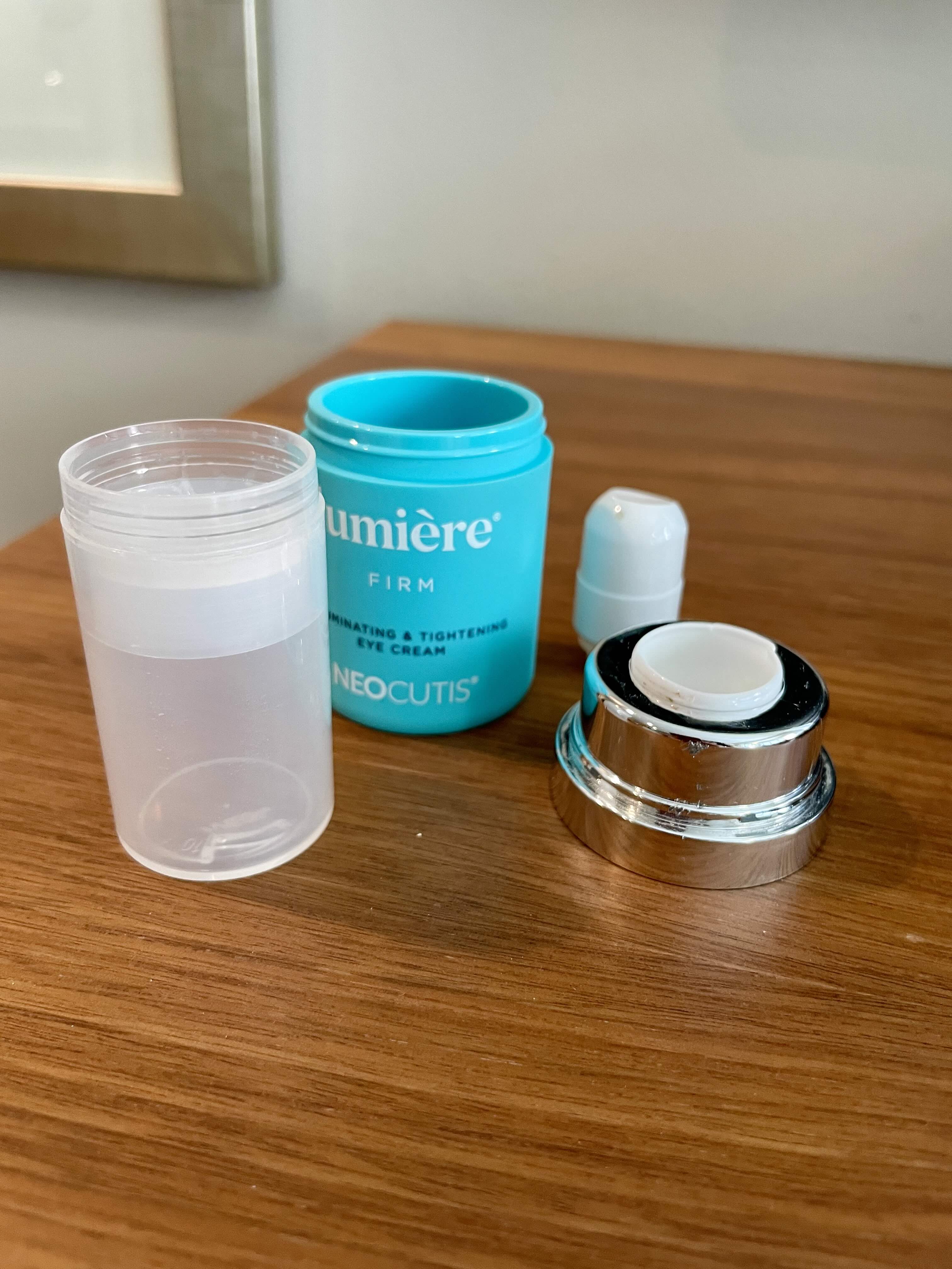
That’s right, empty. No spatula is needed to dig out any remaining cream. The brand created a product package that extracts all of the product for you, so you get every last drop that you’ve paid for. I’ll definitely be purchasing this again. And isn’t that the goal brands should consider with their packaging?
For customers to purchase their products over and over again? It reminds me of that phrase my grandfather used to say: ‘The best customer is the repeat customer’. This eye cream’s #positivepackaging, along with the quality of the product itself, has made me a loyal customer.
Brands, if you’re listening, will you be known for your #shadypackaging, #excessivepackaging or #positive packaging? Because even though we’ve been told not to, customers definitely judge a book (a bag, a box) by its cover.
If you’ve got a story to share about shady, excessive or positive packaging, I’d love to hear it. Follow me and comment @ linkedin.com/in/vickistrull
Stay up to date
Subscribe to the free Label News newsletter and receive the latest content every week. We'll never share your email address.