Bottling spirit of South Africa’s Garden Route
South African packaging design studio Bravo Design has developed new gin bottles for Cape Saint Blaize Distillery, drawing inspiration from the landscape of Western Cape’s renowned Garden Route to reflect the brand’s values of authenticity and innovation.

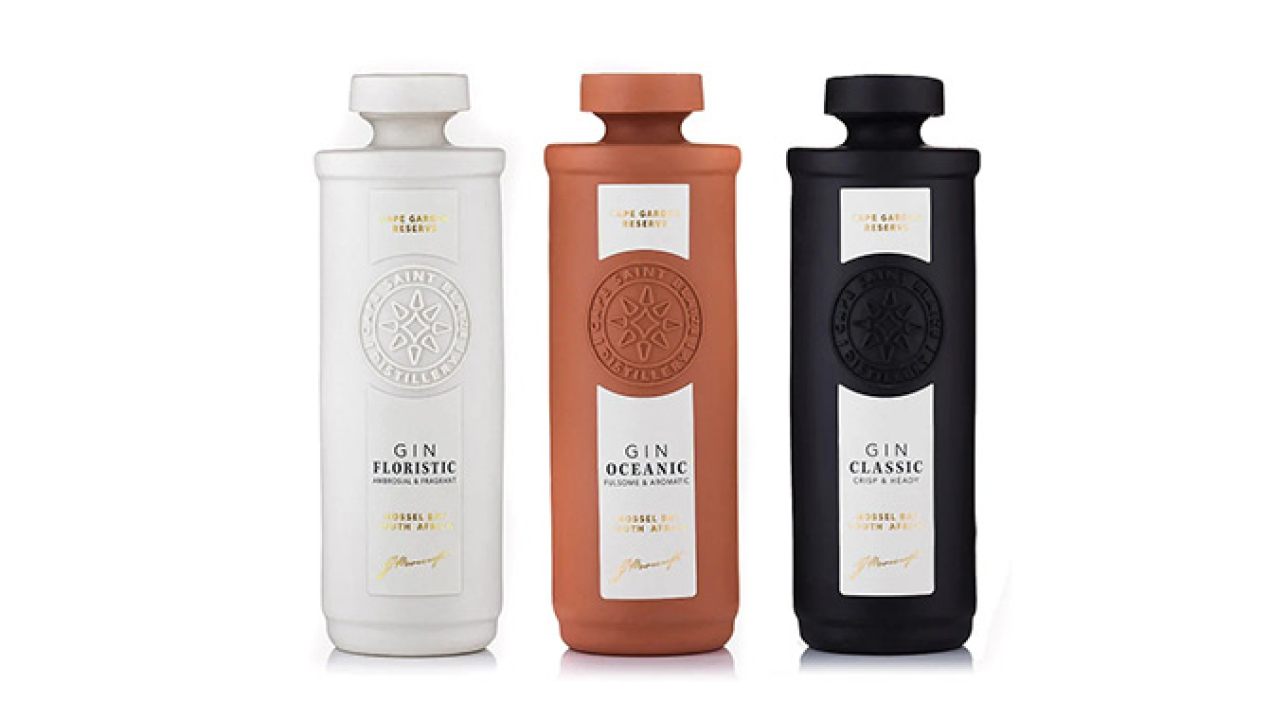
Cape Saint Blaize Distillery launched a range of gins – Classic, Floristic and Oceanic – and required packaging that would stand out in a highly competitive market while evoking the essence of its Mossel Bay hometown. The distillery captures the spirit of Eden through rare botanical selection and artful distillation. Each bottle is distilled, bottled, and hand-labeled as an ode to the gin’s Garden Route heritage.
The design team, led by Brenden Schwartz, owner and creative director at Bravo Design, drew inspiration from the Cape Saint Blaize lighthouse, an icon on Mossel Bay’s coastline since 1864. This, in turn, gave rise to the idea of a departure from traditional glass bottles, leading the designers to work with materials to create a tactile experience; and they began developing a packaging design that would pay homage to the brand’s ethos of creating handmade, artisanal products.
The result was a ceramic bottle representing the clean lines of the Cape Saint Blaize lighthouse and rugged coastline cliffs, offset with high-quality labeling that embraced the distillery’s logo.
Creating a handcrafted ceramic bottle, however, presented several challenges. Although the shape and form of the bottle evoke the historical lines of the Cape Saint Blaize lighthouse, its production was a completely new experience.
‘This is the secret of the design’s success. It’s an innovation from the ground up. None of us had ever worked with a ceramic bottle, and it took collaboration with skilled people from different fields to execute,’ commented Schwartz.
The result is a well-balanced handcrafted porcelain bottle and distinctive brand iconography that ensures the brand engages all the senses. The label embraces the Cape Saint Blaize logo on a thick, natural paper and emphasizes the ceramic design – created in three colors for each gin variant. Besides drawing consumers into the brand story, the packaging speaks to the distillery’s commitment to creating an artisanal product.
Stay up to date
Subscribe to the free Label News newsletter and receive the latest content every week. We'll never share your email address.


