Hardly Water’s quest for the perfect label
For startup brands, packaging can be challenging, with limited budgets and tight timelines often clashing with production and supply chain complexities. These brands heavily rely on label and packaging converters to guide them through the process, ensuring their packaging aligns with their vision and meets market demands.

Hardly Water was founded by Tonya Romin and Jason Therrien in 2021. Romin, CEO of the company, says that the idea of starting a spiked water brand came to her and Jason during Covid to come up with a product that was clean, easy and convenient to drink, and above all else, not carbonated.
‘Everything in the market that we have seen in the last 36 months has been carbonated seltzers,’ Romin says. ‘There's over 3,500 of them in the market, and there's more that are coming out every day, and a lot of them are either malt or spirit based.’
‘As someone who deals with my own health issues, I wanted to create something neutral. Something without complications in sourcing and suitable for a wide range of preferences. For example, some of my family members don’t drink hard alcohol, and I personally avoid gluten because my body doesn’t react well to it. This meant we couldn’t use a malt base. During flavor formulation, we discovered Sugar Brew, a fermented cane sugar-based alcohol. While it's not new to the market and a few companies use it, many don’t disclose it openly,’ she adds.
We know that at bars, people often read labels out of habit or curiosity, so we thought, "Why not make it something engaging?" A couple of sentences about the product, with a little humor to keep things light
Label transparency is a top priority for the brand. Romin underlines that companies should clearly state what's in their products, and that’s why Hardly Water’s nutrition information is prominently displayed on its can labels.
‘At one event, a customer asked if a drink contained citric acid because of an allergy. I explained that this flavor did, but another option didn’t, allowing her to try it safely. She might have skipped it altogether if the ingredients hadn’t been clearly listed,’ Romin says.
For the design of its labels, the brand partnered with Stout Collective, a Chicago-based design firm specializing in beer branding. Stout’s creative team worked closely with the brand to design labels for its cans that not only showcased flavors prominently but also reflected the essence of the product and the founder’s hometown.
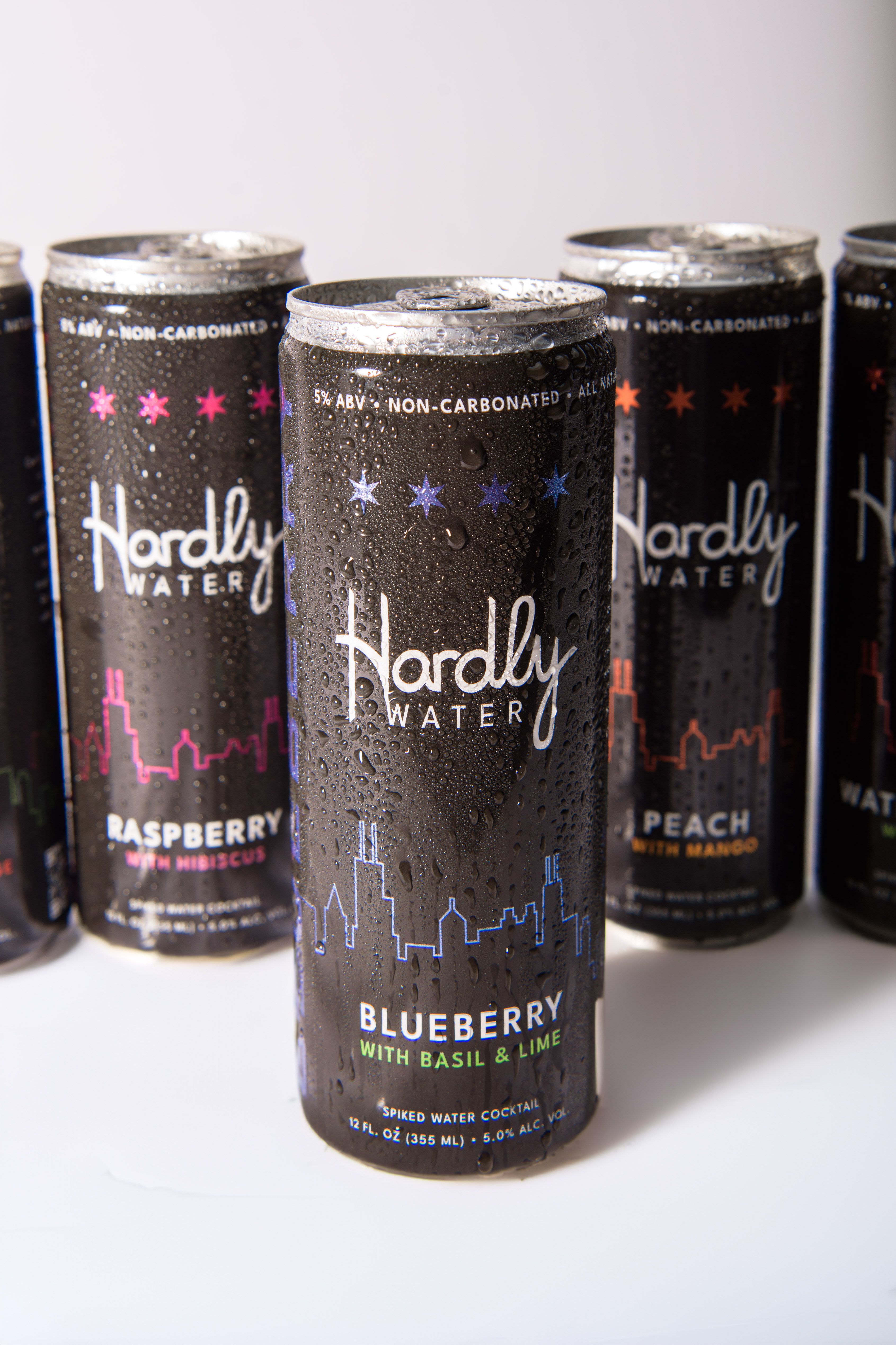
‘We wanted to create something that truly reflects Chicago,’ Romin says. ‘If you look at our packaging, you’ll notice the skyline and the stars at the top. Those are inspired by the stars on the Chicago flag. Additionally, we included our own insignia stamp: the "H" for Hardly, paired with a small Chicago star beneath it. It ties back to our brand while giving a nod to the city we’re so proud to call home.’
Each flavor has its own story, something entertaining to let customers know what they’re drinking. Underneath, the brand highlights the elements of the fruit, offering a fun tidbit for anyone looking to read something while enjoying their drink.
‘We know that at bars, people often read labels out of habit or curiosity, so we thought, "Why not make it something engaging?" A couple of sentences about the product, with a little humor to keep things light,’ she says.
The cans also feature a QR code that directs customers to Hardly Water’s Instagram for news and updates and a link to its website, so customers can stay connected and informed.
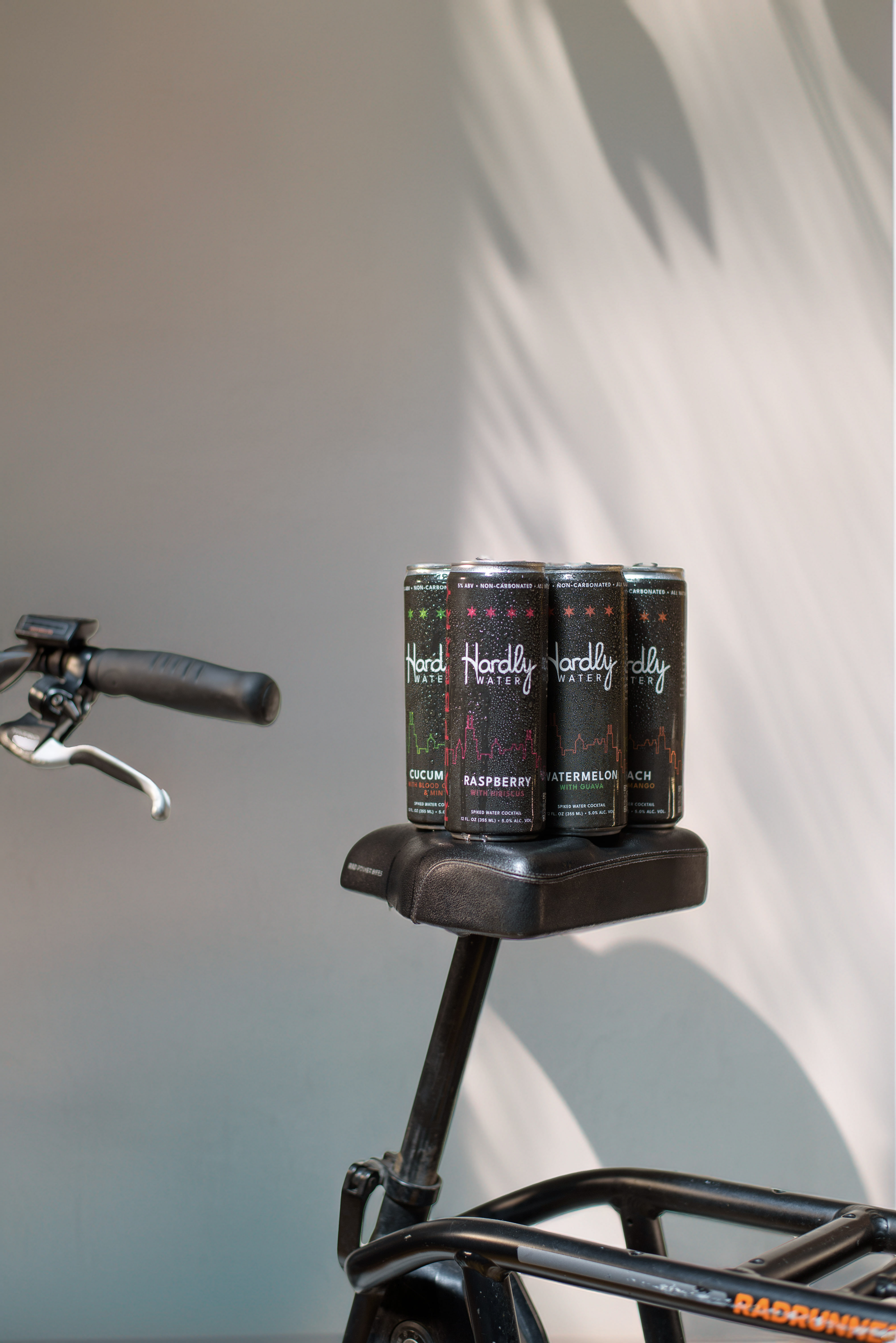
There are five variants of the product in the market.
Navigating print production
Once the designs were finalized, the brand began reaching out to label converters to print shrink sleeve labels, and that’s where things got interesting.
Romin expected a smooth production process but faced unexpected delays. The converter had multiple facilities, and the sales agent was unresponsive. Customer service gave conflicting updates, first assuring timely printing, then extending the delivery timeline.
The brand then connected with a digital printing converter Heart Print who was able to produce digitally printed cans instead of shrink sleeves to meet the timeline to for the brewery.
The brand finally started with three flavors: blueberry with basil, cucumber with blood orange and mint and watermelon with guava to test the market and later introduced the peach mango and raspberry hibiscus flavors. The original design featured a black can with a gray skyline, and the flavor text on the side was outlined rather than filled in.
Once the products hit the market, the brand began receiving feedback. Since the brand initially focused on selling in bars and restaurants, some bartenders pointed out that while the black cans stood out, it was hard to read in dark environments, especially late at night.
‘Taking that feedback into account, we decided to fill in the word "water" to match the other colored elements, and we also filled in the flavor name on the side of the can, (which was previously outlined) to make the label easier to read,’ Romin explains.
These changes were made across all variants of Hardly Water. Additionally, the brand added key details such as ‘5% alcohol’, ‘gluten-free’ and ‘all-natural’ at the top of the can. Even though this information was already at the bottom, the team wanted to highlight it more prominently. The intention was to ensure that as consumers become more familiar with the brand, they could easily spot this important information upfront.
The Hardly Water team preferred digitally printed cans after its experience with the initial production run. However, the cost and volume made it less feasible which is why the brand switched to glossy shrink sleeves on cans for its second run with the new design changes.
A local Illinois converter initially promised a matte finish for the shrink sleeves but, a week before printing, revealed it wasn’t food-grade. The team had to switch to a glossy finish, adding another hurdle to an already challenging process.
‘This was the third label company we were working with. So, in just one year, we've worked with three different converters,’ Romin says.
While many beers use plastic carrier tops for their four and six packs, Hardly Water has chosen a sustainable alternative to minimize environmental impact opting for E6PR scorings.
Clear communication
After going through several hurdles with multiple label converters, Romin notes that communication plays a huge role in the success of any partnership.
‘It's about understanding the process and ensuring clear communication with any partner. If issues arise, it's crucial to be transparent, express the problem, offer solutions or options, and work towards a resolution. That trust and upfront communication are vital to me. It’s frustrating as a customer to spend time and energy investigating problems that the provider should address proactively. For example, while the second company we worked with eventually improved their communication, delays and last-minute updates, such as missing a printing deadline, caused unnecessary frustration. Setting realistic expectations together can make a huge difference,’ she says.
Overcoming packaging challenges as a new brand is not just about finding the right packaging materials or designs—it's about building strong partnerships, particularly with the right converter. A reliable converter can significantly impact a brand's launch, ensuring its packaging aligns with its vision and market goals. This collaboration can ultimately define the brand’s future success in a competitive marketplace.
Stay up to date
Subscribe to the free Label News newsletter and receive the latest content every week. We'll never share your email address.

