Balancing sophisticated gold foiling and intricate illustrations
The elegant application of gold foiling detailing exudes sophistication in the rum brand Faith & Sons labels
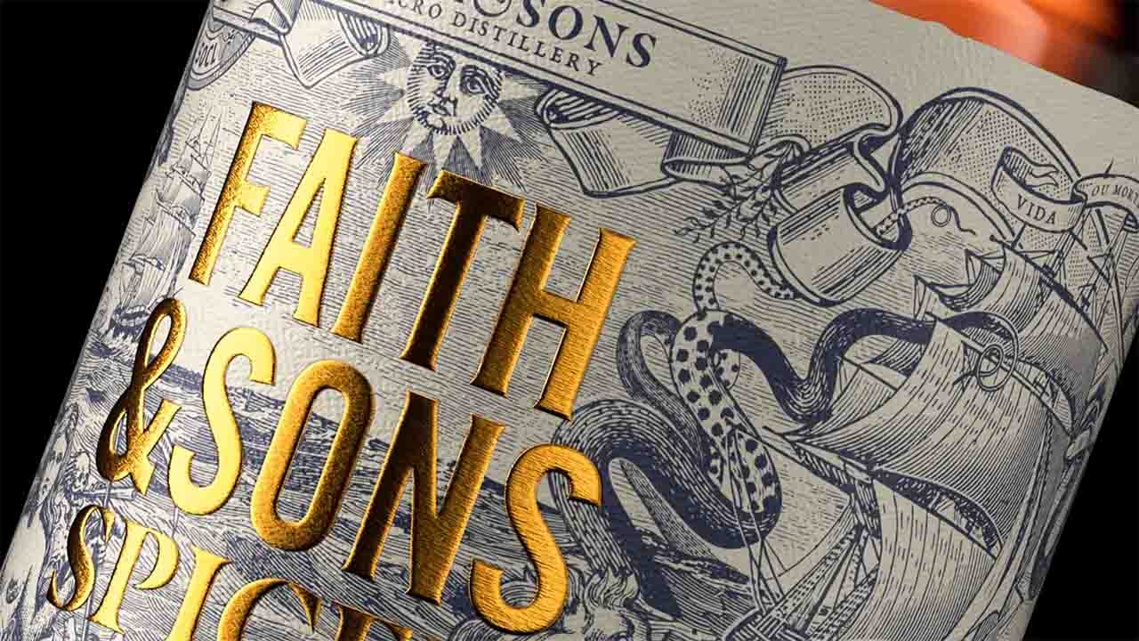
Oveja & Remi's design for the rum brand Faith & Sons seamlessly connects its Manchester origins with its Portuguese heritage. The label narrates the story of the legendary 16th-century Portuguese ship Botafogo, a symbol of holy war, through detailed illustrations.

The intricate portrayal of the ship with its 366 cannons, aptly named for 'spitting fire', captures the essence of the product's history. The elegant application of gold foiling detailing exudes sophistication. At the same time, the intricate illustrations harmonize elegantly with the bold typography treatment, making it a captivating standout on any shelf.
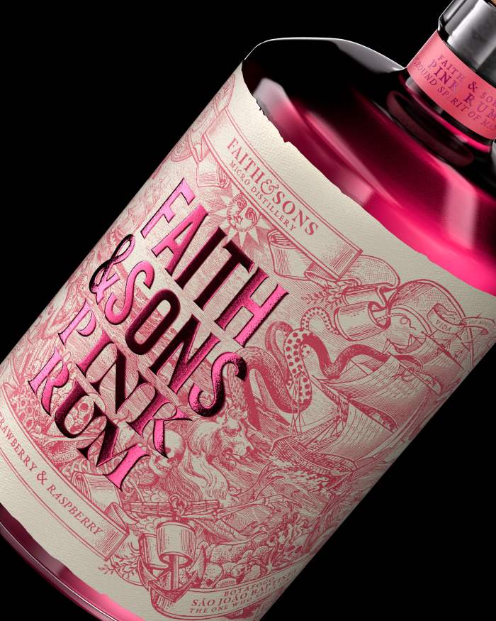
Faith & Sons its a Rum produced in Manchester, but keeping its Portuguese heritage. This label shows through a detailed engraving the history of the Portuguese ship Botafogo, which during the 16th century fought in the holy war.
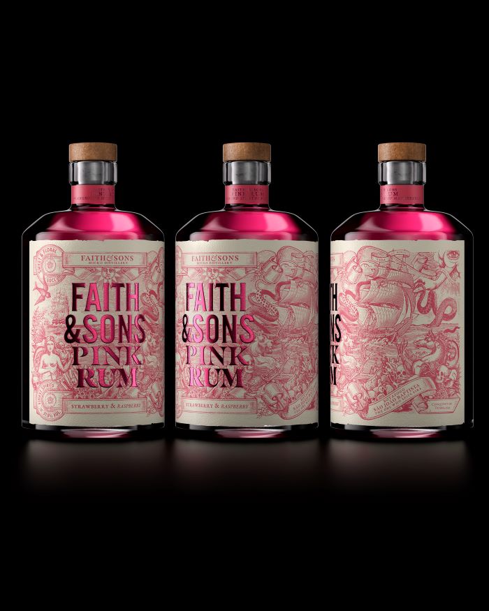
The name Botafogo means 'the one that spits fire' referring to the 366 cannons it had. The name of the product was applied on top of the illustration using gold and pink stamping, using a domed die embossing tool to increase its visibility and readability on the shelf.
This article was sourced from the Dieline and is published with permission.
Stay up to date
Subscribe to the free Label News newsletter and receive the latest content every week. We'll never share your email address.
