Pepsi unveils new logo and visual identity
The new design showcases a bold typeface, signature pulse and an updated color palette

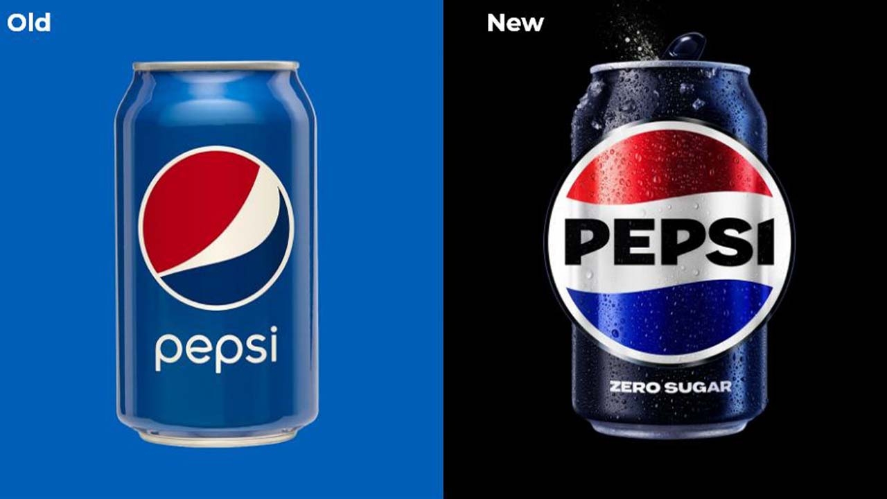
Pepsi has unveiled a new logo and visual identity system, the first update of the iconic Pepsi globe logo in 14 years. Pepsi will roll out the new look in North America this fall in time for the brand's 125th anniversary, and globally in 2024.
The new design evolves the Pepsi brand to represent its unapologetic and enjoyable qualities, and will span across all physical and digital touchpoints, including packaging, fountain and cooler equipment, fleet, fashion and dining. Pepsi plays a critical role in achieving the PepsiCo Positive sustainable packaging targets and in the U.S., as of 2022, Pepsi has begun to convert all 20oz bottles of Pepsi, including Pepsi Zero Sugar to 100 percent recycled PET. The new logo and visual identity pays homage to the brand's rich heritage while taking a big leap toward the future.
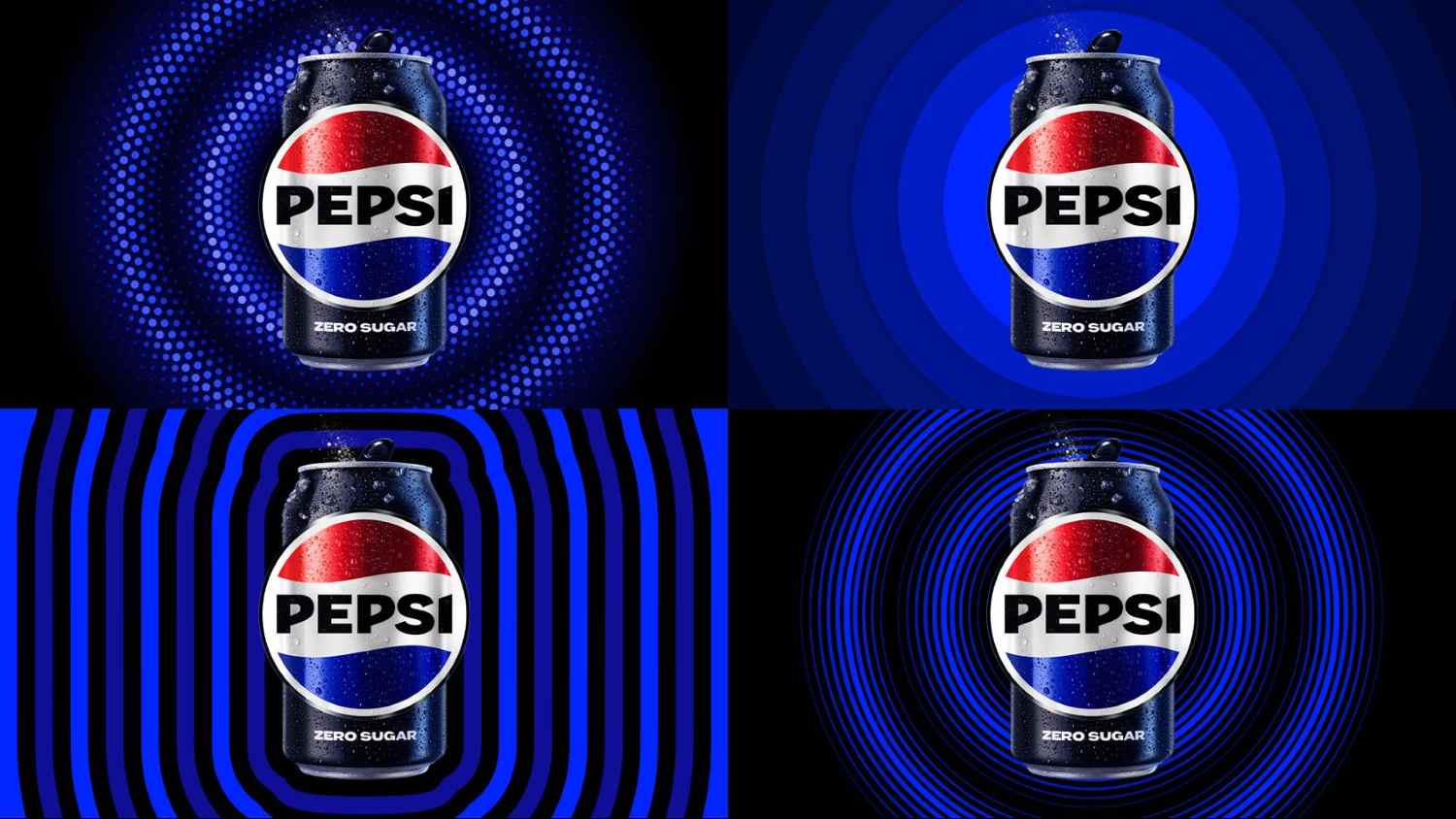
In an increasingly digital world, the revitalized and distinct design introduces movement and animation into the visual system, unlocking flexibility for Pepsi to move between physical and digital spaces, from retail shelves to the metaverse. It also allows for more seamless and creative collaboration with partners and retailers and more versatility to engage fans in the places they shop, dine, work and play.

‘At PepsiCo, we design our brands to tell a compelling and holistic story. Pepsi is a shining example of a brand that has consistently reinvented itself over 125 years to remain a part of pop culture and a part of people's lives,’ said Mauro Porcini, SVP and chief design officer of PepsiCo. ‘We designed the new brand identity to connect future generations with our brand's heritage, marrying distinction from our history with contemporary elements to signal our bold vision for what's to come.’
Todd Kaplan, chief marketing officer – Pepsi, added: ‘Pepsi is an iconic brand that is constantly evolving with the times, as it has been a staple in pop culture and disrupted the category for the past 125 years. We couldn't be more excited to begin a new era for Pepsi, as this exciting new and modern look will drive brand distinction to show up bigger and bolder and help people find new ways to unapologetically enjoy the things they love. This new visual system brings out the best of the Pepsi brand's rich heritage, while taking a giant leap forward to set it up for success in an increasingly digital world.’

The logo and visual identity thoughtfully borrows equity from its 125-year history and incorporates modern elements to create a look that is unapologetically current and undeniably Pepsi. Key design elements include the Pepsi globe and wordmark unite to fit into a variety of settings and emphasize the distinctive Pepsi branding.
An updated color palette introduces electric blue and black to bring contrast, vibrancy, and a contemporary edge to the classic Pepsi color scheme. Given the brand's continued focus on Pepsi Zero Sugar, the design brings in the color black, further showing the brand's commitment to Pepsi Zero Sugar in the future.
A new visually distinct can silhouette, which heroes the iconic Pepsi can as an accessible brand for all.
A modern, custom typeface reflects the brand's confidence and unapologetic mindset.
The signature Pepsi pulse evokes the ‘ripple, pop and fizz’ of Pepsi-Cola with movement. It also brings the rhythm and energy of music, an important and continuing part of the Pepsi legacy.
The new Pepsi logo and visual identity will debut this fall in North America, followed by a global rollout in 2024.
Stay up to date
Subscribe to the free Label News newsletter and receive the latest content every week. We'll never share your email address.

